The Difficulties of Decorating a Dry Dock
I like to think my clan’s dojo looks pretty cool. It’s been a while since I last talked about decorating my dojo, but I’ve done a good job. The place looks awesome, and I’ve decorated most of the rooms now. There’s even a giant statue of a Volt that I built. Many of the rooms are actually partially or completely redone. In fact, aside from the robot room and cosmic garden, most rooms have a facelift and a matching theme.
As it stands, there are only a handful of rooms left to decorate. There’s one large room and a couple of corridors that need decorating, but most of it is done.
Except for the Dry Dock.
When it comes to large rooms, I actually don’t have a problem decorating them. I’ll generally take a screenshot of said room, paste it into paint or whatever and do some quick scribbles over them. This allows me to visualize the terrain and what I want to build. I often normally have a theme in mind before I start building too. For most of the dojo, the theme has turned into “dark garden”. In some places, this changes to “orokin garden” or “orb vallis garden”. But overall most rooms have a central theme, and I do my best to try and blend themes together.
For some reason though, I can’t get my head around the Dry Dock.
It’s just too big and weirdly shaped.
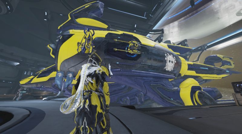
Most rooms are simple. They are big square rooms. The Dry Dock is theoretically a massive rectangle. But it has a massive ship in the middle of it. The room also directly faces into a space-based skybox, but one that’s surrounded with antennae and various shields.
There are also LOTS of unbuildable areas in the Dry Dock. Your Railjack takes up most of that space, but plenty of other areas are weird too. The lower platforms that head to the entrance of the ship can’t be built on, and neither can the unusable console once you’ve finished the Railjack starter quest. The same applies to the two consoles where you customize your railjack and the entrances into the room. And on top of all of that, you also have a hovering cargo thing that floats around! And you can’t build in its path.
I can’t find a theme that works.
The bigger issue is that I am trying to blend Tenno architecture with, well, anything else. And there’s not really that much Tenno stuff to really work with. In fact, Tenno architecture seems to clash with other Tenno architecture, since the Dry Dock doesn’t quite mesh with the style of the rest of the dojo!
And because there’s so much space, you need to spend a lot of time blending everything together. If I want to build a garden theme, then I have to cover up all the technological areas. However, that chews into a huge chunk of the available ‘capacity’, which means I have less capacity to actually start decorating. So not only do I have to somehow cover up all the massive, unreachable areas, I need to do so with a lot of efficiency. After all, what’s the point of covering everything in rock if I then don’t have any space left for trees and grass?
“Why not leave it as it is?”
I mean, sure, I could do that. But doing so is… kinda too easy. It’s not even that a plain dry dock is boring. By far, dry docks are the most interesting rooms on Dojos. Especially since they have NPCs. Overall, Dry Docks aren’t boring, even if left plain. Outside of trading rooms though, dry docks are also the second most-visited places IN a dojo! And since people will actually see the room, I want it to look nice. And I do want it to match the aesthetic of the rest of my dojo, which I have been painstakingly decorating over the last year or so.
I’ll work out how to decorate this room eventually, but damn, the Dry Dock is just an all-round pain in the ass to decorate!
