Apocryph (Alpha) Impressions
“Apocryph an old-school fantasy shooter such as Hexen, Heretic, Painkiller and Strife..”
The video drew my attention, and that isn’t just because the title name dropped Painkiller. The aesthetic and the rather awesome minigun-staff is what made me pay attention to the video. And since the dev is giving out the alpha build for free, I decided to download it and gave it a spin.
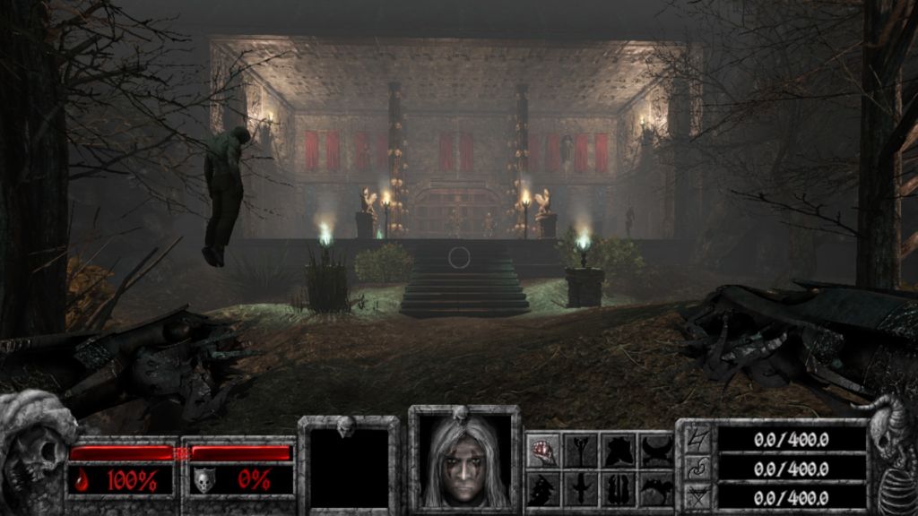
The first thing I noticed was that the main character’s picture on the HUD makes him look like a younger Geralt of Rivia who joined KISS as a backup drummer. The atmosphere was grimy and dark, and I am armed with only my fists. The foes standing before the wooden doors, skeletons armed with blades and glowing with a faint green light, charged at me as I approached the door. But before I talk more about the game, I would like to comment on that corpse being stuck on the branches on the left of the picture.
In the demo, corpses are everywhere. They are pinned on walls with blades, hanging on a hook at the end of a chain, being run through a giant spike mounted on the ground, et cetera. And the problem is, they set up the atmosphere as well as Random Speck Of Dirt On The Floor #35728. I see a corpse when the game starts, I see it when I turn a corner, I see a horribly mutilated corpse about every thirty seconds and I’m not even rushing through the game. They are just scattered around like confetti.
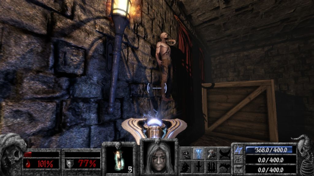
I should not, under any circumstances, be saying to myself “oh, a corpse” with the same tone as saying “oh, a bird”. A corpse as a set piece in a fairly serious setting that Apocryph seems to be going for is meant to carry weight and affect the player, and having so many of them lying around just desensitizes the player. If the lore gives a justification for the corpses appearing everywhere, then it gets a pass. Otherwise I really don’t think the corpses are utilized well as set pieces. Fallout 3, in my opinion, uses corpses really well as set pieces, most notably at the Springvale Elementary School. This is because they know when and how to use it.
Back to the game. The actual combat reminded me about what I love most in Serious Sam 3: fighting projectile enemies. In other FPS games, the enemies use hitscan weaponry, and there is very little I can do in a firefight to avoid damage aside from ducking behind cover, twiddling my thumbs until they stop shooting to reload. But when enemies use projectiles, there is now a new option available. You can dance around the projectiles, sidestepping enemy attacks while returning fire instead of waiting for them to reload before popping out of cover to take a shot. Having the ranged enemies use projectiles not only fits the fantasy theme, but it also make combat far more fun and engaging.
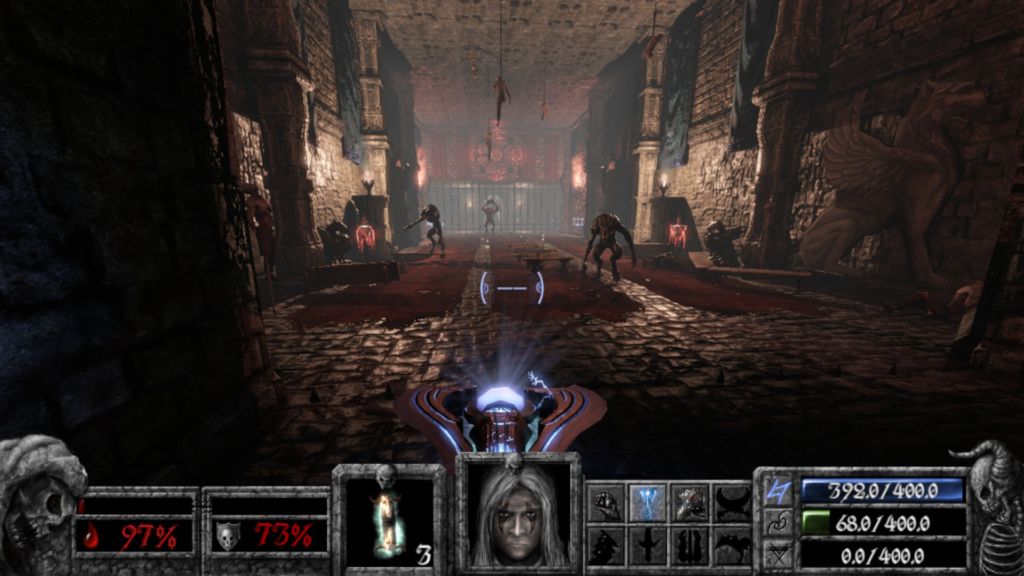
However, the combat seems to be rewarding a more twitchy, Wild West quick draw style combat than the more graceful and movement-based combat. The chamber you see above is half of the largest area you’ll be fighting in, and both areas are separated by an opening about half the width of the chamber. And there are many fights taking place in narrow, winding corridors. In general, the environments feel more cramped, more akin to the tunnels in Painkiller rather than the arenas within giant cathedrals and open spaces where my movement is largely unhampered. The smaller spaces limits movement and rewards being quick on the draw, gunning down enemies before they start firing. Apocryph’s movement involves a lot of peeking and firing around walls in hallways, which is rather different from my preferred playstyle of weaving around a flurry of projectiles and kiting my enemies around in a big, open space. That is not to say, however, that dodging is optional. Movement still plays a rather big role, as the fistfight you got into with the skeletons in the beginning demonstrate. Reading your enemies’ movements, maintaining the right distance, and serving them knuckle sandwiches can only be done by moving properly. Overall, the combat is solid and fun.
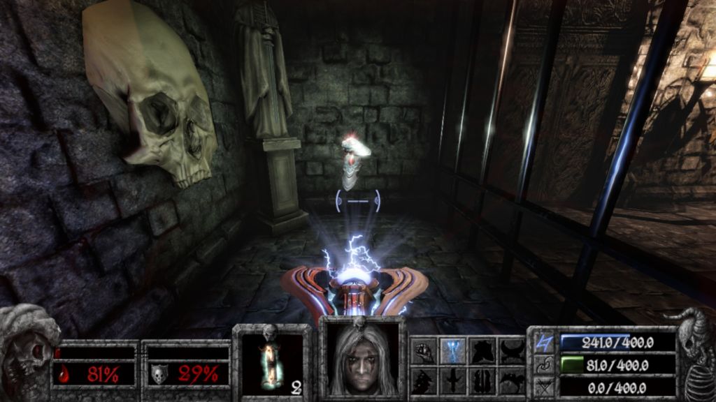
Over here is one of the moments about this game that I quite like. The thing before you is a pair of magical vambraces that essentially works like an SMG. When you picked them up, the fake wall behind it slides away, revealing a giant melee bruiser mook who immediately charged at you.
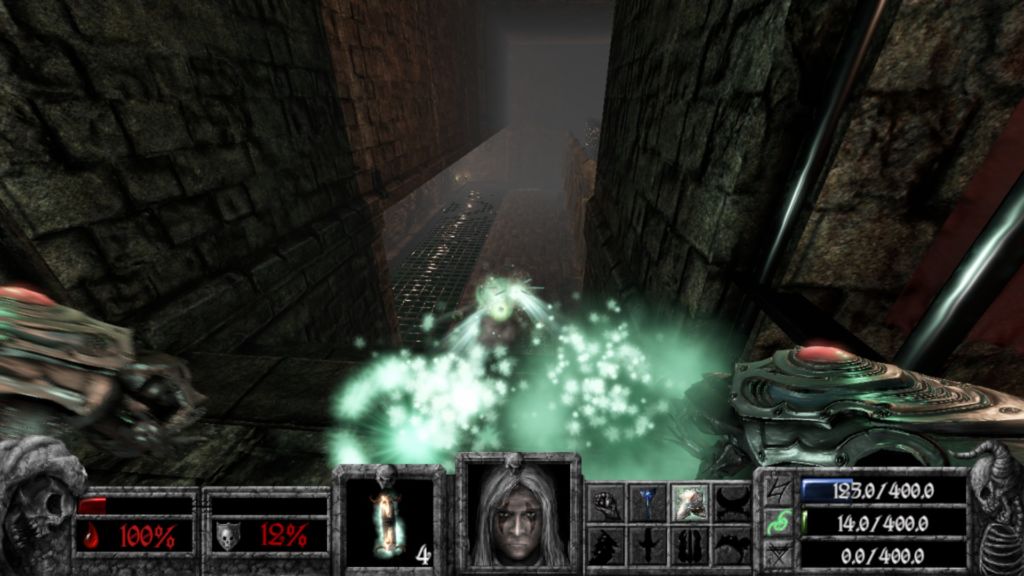
Naturally, your first reaction will be to back away and start firing. I find that this is a pretty good way to introduce players to a new weapon, as it causes players to start firing in a moment of panic and let you have a taste of how the weapon works. Sure, this will probably only work once, because repeating it will just make people sick of the ambush that people expected from miles away. But in here, this is done well.
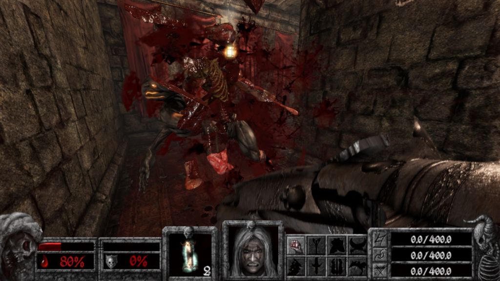
This game also features gibs. As a avid fan of gibs in FPSes, I absolutely love their inclusion in this game. They add a lot of impact to how the weapon feels by implying how powerful each shot is by tearing its target apart.One that that irritates me, however, is that sometimes the game will go into slow-mo when an enemy is gibbed, seemingly at random. I think it’s meant to show off the gibbing, but even without it getting old, it’s really annoying because it grinds the game’s pacing to a halt. This is a feature I can do without.
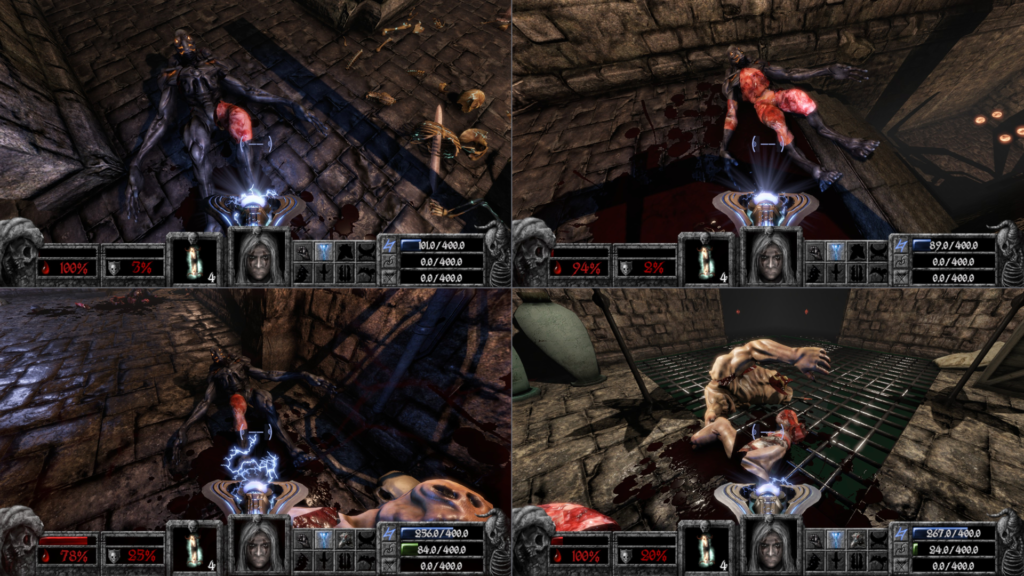
Aside from that, I notice that they are also implementing a damage engine similar to what Loadout did, which I talked about in an article before. Apocryph features a damage engine that divides the character model into a few segments. Depending on where you shoot, the corpse will actually reflect where it took the most damage. The skin will get torn off, exposing raw, bloodied flesh. And as the lower right part of the picture above shows, gibbing is also affected by where you shoot at as well.
I wish that they can carry out this concept a lot more further like what Loadout has. Segment the enemy character models more, and have the character models reflect where they are taking damage when they are running around attacking you. Currently, the damage only shows after they are dead. Let the movement of the enemies reflect the damage they are taking. Getting shot in the arm makes that arm flop around feebly and have the monster put all of its attacks on the other arm. Getting shot in the legs makes it limp. Also have the death animation reflect it too. I really love what they are trying here, and I do wish to see it explored and refined even more.
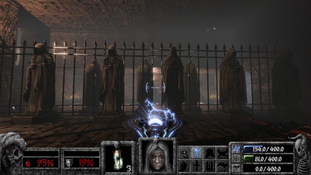
The visuals of the game, aside from the issue with too many corpses as mentioned before, is astounding. Dark, foreboding, the medieval dungeon aesthetic is extremely good to look at. Sure, the environment seems to be composed of a few thousand shades of brown, but since there is only one level released in this beta for now, I shall reserve my judgement on this. On its own, there is nothing wrong with brown environments, but it will get dull pretty quickly if that is all you have.
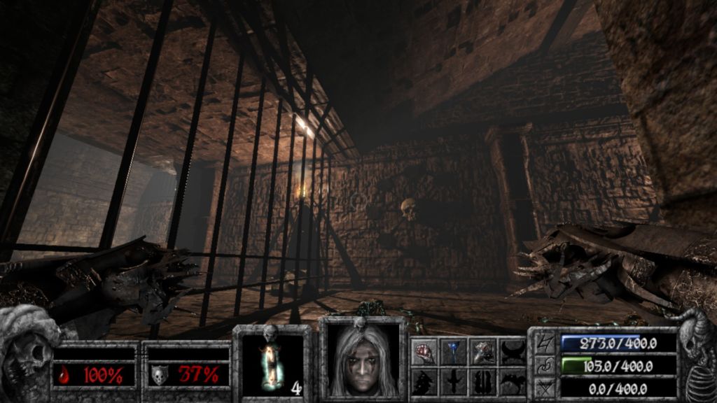
The lights cast dark shadows across the walls and floors, further emphasizing on the gloomy atmosphere. This also makes the monsters stand out more as they generally have glowing eyes, and the projectiles are bright and are easy to notice even during a frenzied combat session. If I have to pick on one thing, it will be the pale fog that makes everything at a distance seem washed-out and pale. In my opinion it doesn’t look good. It does make things that are closer stand out a lot more, which is good in a gameplay sense, but in terms of aesthetics I don’t like it much.

For comparison, I used what I believe is a bug to get rid of that filter. In my opinion, the game looks better this way. The entrance to the castle now looks darker and more menacing. However, this also makes the corpse hanging off a tree on the left much less visible. I personally prefer to have the choice to either turn this filter on or off.
As for the bug in question, it involves the “Pixelize All” and “Pixelize Color Filtering” settings. “Pixelize All”, among other things, turns off the filter. The game, however, does not revert all the texture and filter settings when you disable “Pixelize All”, so I can use this to keep that filter off.
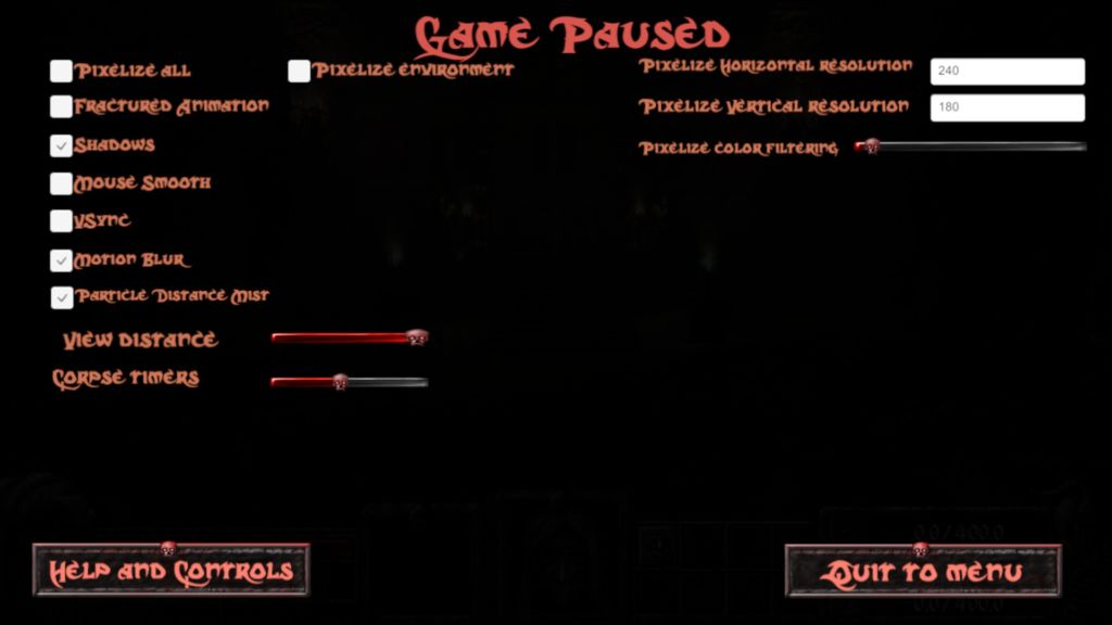
And if you want to know what “Pixelize All” actually does, take a look:
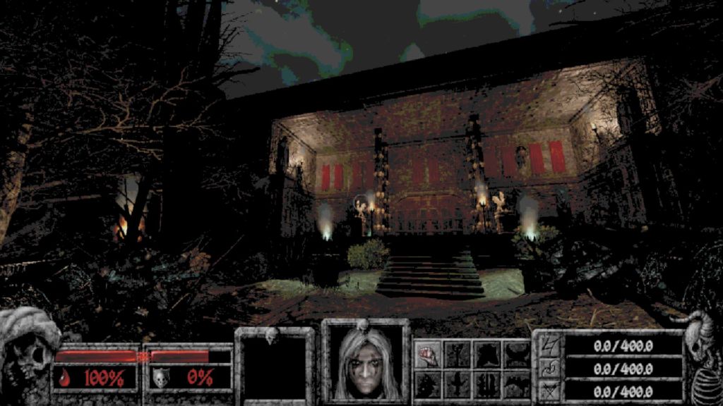
It basically changes the game’s graphics so that it resembles an old FPS. You can adjust the resolution according to your taste, and “Pixelize Color Filtering” allows you to adjust the colours of the game in this mode, as seen below:

As far as I can tell, the slider mainly affects the saturation of the colours and the brightness. Other than that, the “Fractured Animation” makes all animation choppy, so that it resembles the sprite enemies in Hexen and other old FPSes. It is a rather fun thing to have, as a callback to the older FPSes. It’s probably not something I’ll play with for more than two minutes, but it’s a nice touch.
As for sounds, the game’s sound design is OK so far. However, for some reason, my melee strike with my left fist creates a sound similar to the chimes of an old grandfather clock. I am not entirely sure whether that is a deliberate choice or a bug, but it is rather peculiar.
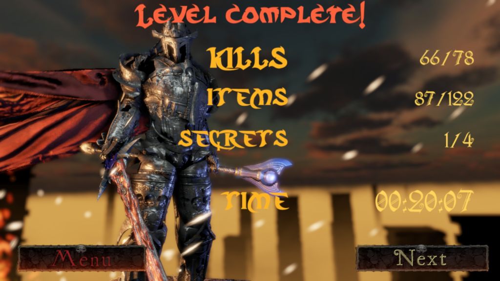
Overall, I like what I see so far. The combat, the enemies, the environment and the damage engine are pretty good. As an alpha build it manages to show off a fair amount of its features, and I do recommend people to sign up here and try it. It will be, at the very least, able to give you a rather enjoyable half an hour, and I am eager to see the game’s full release someday.
