On WordPress 5.0
WordPress 5.0 came out late November. Not long afterwards, WordPress 5.0.1 and WordPress 4.9.9 came out to address a bunch of security issues. Not long after that, WordPress 5.0.2 was released to deal with some bugs.
Now, normally I update WordPress as soon as I can, after checking that there’s nothing weird. All my WordPress installations are set up to automatically download and do security updates, but it’s worth checking before you do a major update just in case a plugin is no longer compatible. Most plugin authors will want to update their work as well, so you’ll always end up with a big string of updates that you need to do in one go.
WordPress 5.0 though is different. WordPress 5.0 says “good riddance” to the editor we’ve been using all these years and instead replaces it with… I’d like to call it a block editor, but it’s not quite like plugins like Elementor or Siteorigin Page Builder. But it’s also not a basic text editor the way WordPress 4.9.9 and lower all have. It’s a weird mishmash between the two. It’s a massive change as well. A change that burrows right into the roots of WordPress.
Because a core feature of WordPress has changed, I went and did three things: I delayed updating my sites to 5.0.2 (in fact I only updated the Daily SPUF to 5.0.2 the other day), I created backups before updating (I do that anyway) and I went and installed a plugin that allows me to switch back to the Classic editor as needed. There are over 2000 articles on this website, I didn’t really want to have to deal with breakages over the Christmas break.
And frankly, the main reason why I did all this is because I don’t think the new block editor is very good. It’s not like I didn’t give it a try or anything, I did. I tried several of the betas they released and even wrote an article about one version of Gutenberg, the plugin version. It was more of an angry rant than anything else though, to be fair.
The thing is, I’m saying this from both the perspective of an experienced WordPress user and the perspective of an idiot.
From the perspective of an idiot, it’s all very… tidy and tucked away. All the toolbars only appear when you hover over them, things like text size and all that are on the side bar and there’s a HUGE amount of white around here. Apart from hitting enter to make a new paragraph, it’s not really obvious how you do anything else. You hit the + button in the top left corner. But I’ll be honest, that looks a lot more like a “New Post” button than a “add images, blocks, etc.” button. Sure, there’s a lot of new little things, like columns and embeds and stuff like that, but it’s all hidden away by a very small + button. It’s all simply not very obvious.
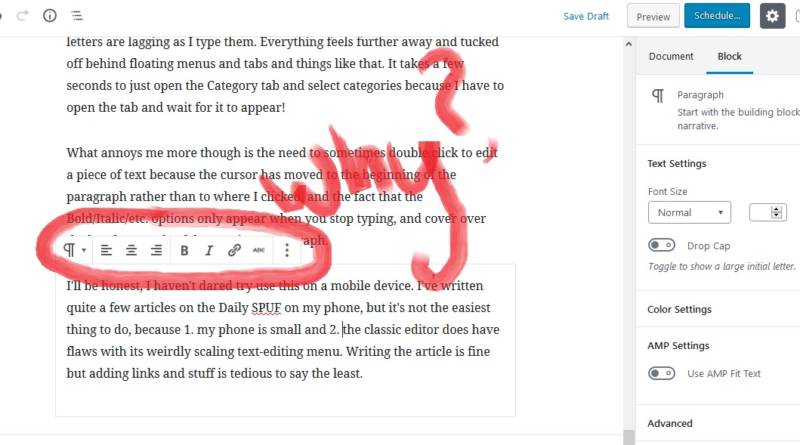
From an experienced user’s point of view, it’s more annoying than anything else. Sure, there’s a part of me that simply doesn’t like change, but I swear that writing in the new block editor just feels slower somehow. As if my letters are lagging as I type them. Everything feels further away and tucked off behind floating menus and tabs and things like that. It takes a few seconds to just open the Category tab and select categories because I have to open the tab and wait for it to appear!
What annoys me more though is the need to sometimes double click to edit a piece of text because the cursor has moved to the beginning of the paragraph rather than to where I clicked, and the fact that the Bold/Italic/etc. options only appear when you stop typing, and cover over the last few words of the previous paragraph.

I’ll be honest, I haven’t dared try use this on a mobile device. I’ve written quite a few articles on the Daily SPUF on my phone, but it’s not the easiest thing to do, because 1. my phone is small and 2. the classic editor does have flaws with its weirdly scaling text-editing menu. Writing the article is fine but adding links and stuff is tedious to say the least. This new interface though relies too much on hovering on things.
The worst thing though is when you switch to Code Editor, which is the Text view on the classic editor.

You see, normally all you need is a <p> and a </p> to denote a paragraph. But the new block editor inserts a ton of comments before and after each paragraph as well. Which means that editing code has one extra layer of things to go wrong. I can see needing those for other, more technical blocks, but why for normal paragraphs?
The issue is, 5.0 was supposed to make text editing easier to do, and make it match what it will look like when your post or page is published. But it doesn’t really do either of those things! For example, this text right here while I type in the editor is a serif font but when you read it, you see a nice sans serif font. And because of the weird lag while writing, as well as having to relearn this new interface, I’m not writing as efficiently either.
Luckily, for now, there’s the Classic Editor plugin. That allows me to switch back to the old editor as I please. But this is a temporary solution. It will only be supported for 2 years, after which I will HAVE to just deal with the block editor.
By then, I’ll probably be begrudgingly used to the block editor. But until then, I’m going to use the Classic Editor plugin as much as possible. If only so I don’t get this horrible lag while typing…
