The Eternal Quest for More Fonts
I have too many fonts.
Too, too many fonts.
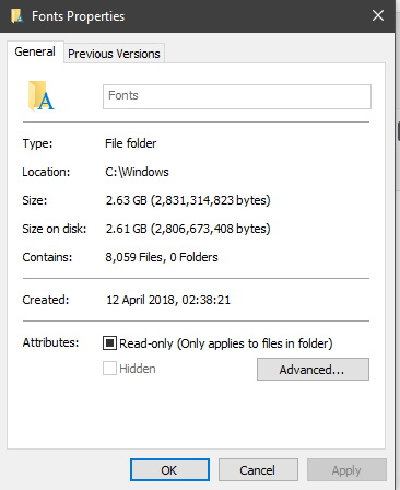
As it stands, I have about 8000 files in my Fonts folder. It has reached a point where the drop down window in Adobe Illustrator no longer works, because I simply have too many fonts. Or it might be because there’s one or two corrupted mods in there somewhere and I’m too lazy to go through all 8000 fonts and find which one it is. These fonts cause issues in other programs too. I can’t change the font in Windows Movie Maker without causing a five minute hang and MS Paint simply crashes, because they both decide to display a preview of the font as well.

And don’t get me started on Photoshop. Even before my font addiction, I would have serious issues when selecting the text tool for the first time. Now I need to switch tabs and wait for Photoshop to sort its shit out before I can actually do anything with the text tool.
But why do I have so many fonts? Because I might need them.
You never know when you’ll need a font. Let’s put it this way: The 8000 or so fonts I have? About 90% of them are available to you as well. There are millions of fonts out there. Not just individual fonts but font weights and variations as well. Just look at Arial, the font everyone knows! It has a normal weight version, bold, italic, bold AND italic and a black version. That’s five font files. There are other fonts that have even more variations. Calibri has a Light and a Light Italic variant. Open Sans, a common web font, has Light, Condensed and Extra Bold variants, each one having an italic version as well.

You could have so many variants of a font, it’s insane. On top of the fact that there are already so many fonts out there. I mean, making a font is relatively easy these days. Sure, it’s hard to make a genuinely good, easy to use and readable font with multiple language support, all the right characters and proper kerning to make sure all those characters are properly spaced, but making a basic font is kinda easy. Heck, you can make your own handwriting into a font.
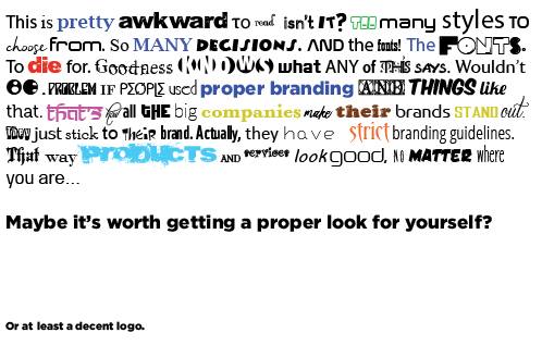
What I use these fonts for depends on the job. Sometimes it’s to give plenty of samples when it comes to making new artwork. Sometimes you need to find a font to go with existing artwork, or you need to redraw a logo or something. A large company will probably have a style guide or brand guidelines for you to use, which details which colours are allowed and what fonts and font weights should be used where, but most small companies don’t have anything like that. In fact, most people don’t even seem to have a vector or .psd or otherwise original version of their logo at all. So, in order to make sure all their artwork matches, I need to find the right fonts.
But sometimes, having the right font ISN’T ENOUGH.

You see, not only are there a bunch of different variants, as well as a huge number of fonts that look similar, you can also mess around with the fonts themselves, squishing and stretching and playing with them, changing the space between characters and then converting them into outlines, allowing you to contort a font further. Sometimes a font is so unrecognizable that I have no choice but to redraw it.
By hand.
Which, depending on the font, can take hours.
Having 8000 fonts means that, hopefully, I don’t have to resort to redraws…
Pingback: The Archaic Beauty of Windows Live Movie Maker - Shields Create