Youtube’s New UI is Annoying as fuck
I know I literally wrote an article the other day on a similar premise, but holy fuck Youtube what are you doing? Sure, Youtube had had some pretty bad UI changes in the past, but what the hell am I looking at? What is going on?

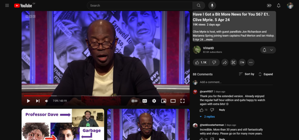
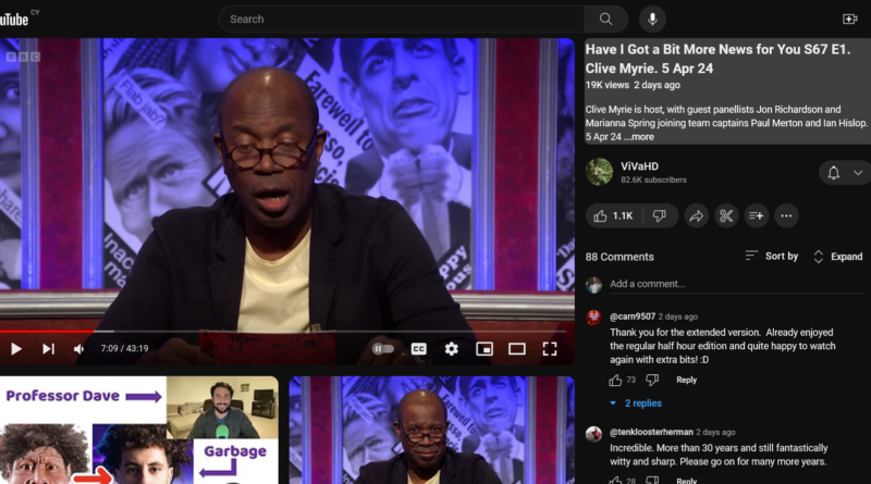
Look at this mess. The comments are all squished to one side, the title is squished to one side and the recommendations both have hideous rounded corners (way, way too rounded, considering that the main video has square corners) and the thumbnails are fucking massive. The layout looks like Twitch but worse. All the video information is squished to one side and you can only see the top of the recommended videos. The video itself also feels smaller. I don’t think it IS smaller, but since the video info is all on one side, it does feel more cramped.
One could argue that having comments on the side isn’t so bad because you can see the top comments without scrolling, but top comments 1. often contain spoilers, 2. the comments feel crushed because they are forced to take up less space now and 3. you still have to scroll to read them anyway. You also have to scroll more because the smaller area for comments means fewer comments can be displayed at once. By default, comments are kinda hidden away, and you have to expand the comments section in general to read more than just the first one.
I originally wondered if this was a way to show you more recommended videos (which Youtube desperately wants you to click on) but the new layout fails at doing that as well. Sure, you get a big grid of videos and you do see more of them, but you can’t see any of them without scrolling. Which makes it harder for you to pick a video after you’ve finished the one you’re already watching, because there’s no recommended video in obvious view. On my screen at least, I HAVE to scroll to see what the next recommended video is, if I also want to have comments displayed by default.
Switching to Theater Mode helps a little, but then I have to scroll to see anything apart from the video. I’ve also noticed problems with the video UI itself, if you’re not at 100% zoom, the video controls become spotty and unresponsive. While trying to go back in a video, I’ve found myself accidentally pausing the video or hitting one of the buttons beneath the bar.
What bothers me is that everything feels squished and you can see less. Comments are squished away. Video information (you know, useful stuff like the video title) is squished to one side. Everything is squished with rounded corners. It’s all very much in-your-face and quite distracting.
From what I can tell, this is being rolled out to random users, so I have no idea when this will become the new look for everyone. It may go through some tweaks and stuff before being rolled out, but Youtube kinda tend to ignore feedback and just go ahead with things, even if people don’t like them. While looking up how to revert back to old Youtube, I stumbled across quite a few Reddit threads about people complaining about the layout. I’ve also seen a few people say they like it, but none of them have said WHY they like it.
Luckily, I found a fix for this. I use uBlock Origin as my adblocker, and it also allows you to add custom filters. Under uBlock’s settings, there is a tab called My Filters. There, you can add the following line of text.
youtube.com##+js(set, yt.config_.EXPERIMENT_FLAGS.kevlar_watch_grid, false)
This should keep your Youtube looking normal… for now at least. At some point, Youtube will flick a switch and everyone will get the new layout. Although, hopefully, when that happens, there will be far more options on how to fix it, as well as a myriad of browser extensions to revert Youtube to its old self. There already are a few, but they’ll become more mainstream, if or when Youtube changes everything.
If only you could easily opt in and out of these things, rather than Youtube just randomly changing them for random people. Would be a better way of getting feedback as well. Oh well.
