The New Steam Library
I’ve been meaning to write an update about the new Steam Library look for a while, but I’ve not been able to put my finger on when it comes to what I do and don’t like about it. But frankly, the very first thing I did when I saw the new Steam Library was roll my eyes.
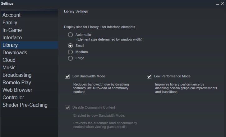
The second thing I did, as soon as I saw the Steam Library, was wonder why it was weirdly slow. Turns out, the Steam Library shows a ton of community stuff and has loads of transitions and things like that. Thanks to the old TIAM people from the remains of the Off-Topic Section of SPUF, I swiftly discovered that there was a low performance and a low bandwidth option. Both of which I immediately turned on.

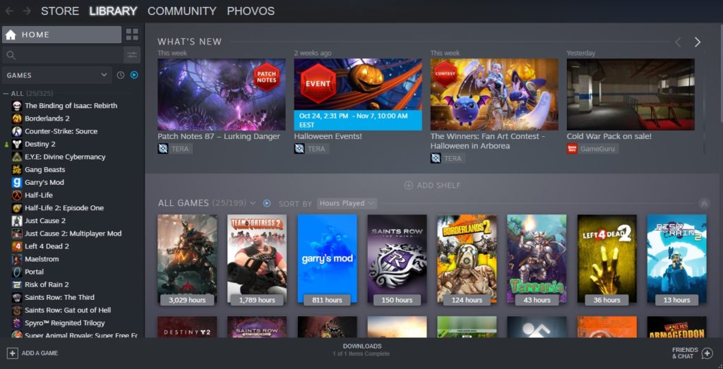
I had seen these changes coming, but if I’m honest, it’s more of a visual upgrade than anything else. A lot of changes in adding new pictures and graphics and stuff like that, as well as showing what your friends are doing. Much of the new Steam Library is community and friend focused, as there’s little icons that show whether friends are playing this game and every page has links to community pages and recent friend achievements and things like that. Ironically though, at a glance, I’ve actually found it less obvious to see WHO is playing a game at any one time. You have to scroll down, past the fancy splash artwork and any recent update news to see the list of who is playing right now and who has played recently.
But honestly? All of these icons feel like… a waste of space. When I click on a game to play, do I really need a large image splash of the title of the game I clicked on? One that actually takes up about half the page on my somewhat small monitor? No, I don’t. Really, the boxes on the home page, even when set to “small” are too large. It’s all images. You don’t need to take up that much space.

Going back to the new Steam Library itself, there’s also a lot of… I want to call it customization and focuses on creating collections and all that. Steam wants you to make collections of games and put them on display in different shelves and show things off and things like that. And it’s all taking up so much space, yet feels somewhat redundant because I have a list of all my games to the left of my screen. I suppose the toggle for “ready to play games” is nice but we… already had that.
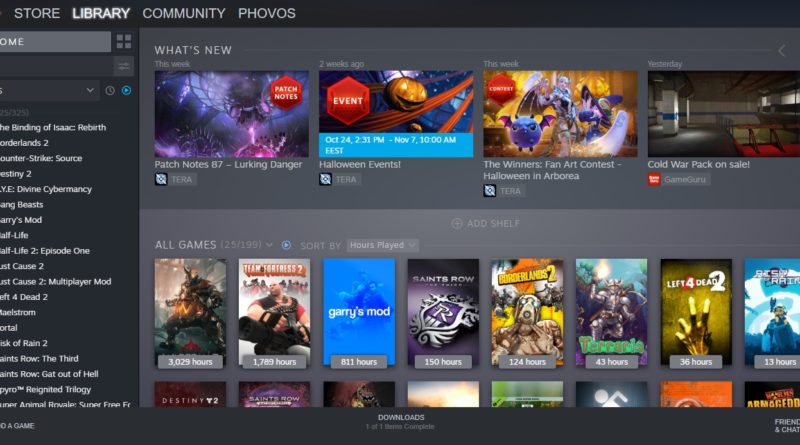
What bothers me the most though, by a long, long shot, is how much space goes to “OH LOOK NEW GAME UPDATE STUFF!” There is an un-removable ‘shelf’ at the top of your Steam Library that shows latest update news. For me, it’s currently filled with THREE posts for TERA, an average MMO that I’m not enjoying but am playing for the sake of my sister because she has no money and a laptop that is falling to pieces. The next bit of news is for GameGuru, a game engine that I never actually got around to looking at and don’t have installed.
These are basically advertisements for games I already on, taking up far too much visual real estate at the top of my Steam library. This is supposed to be my new, customizable game library but there are so many things I can’t actually customize. I can’t click and drag games and move them around my library and order them in a custom fashion. Sure, I can organize games alphabetically, by last played, by friend activity or by Metacritic score and I can give games their own custom cover art, but I can’t put my games in any old order, and I can’t make each game as big or small as I want in the window or stop everything taking so much space. And I can’t remove these adverts for games I own but am not interested in.
I don’t want the latest news for TERA to be the first thing I see in my Steam Library. It’s all designed to be both pretty to look at and to shove what are essentially adverts in our faces. I just want all my games in a nice little grid. But that’s clearly asking for too much.
