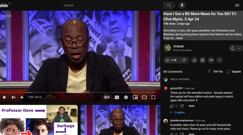
Youtube’s New UI is Annoying as fuck
I know I literally wrote an article the other day on a similar premise, but holy fuck Youtube what are you doing? Sure, Youtube had had some pretty bad UI changes in the past, but what the hell am I looking at? What is going on? Look at this mess. The comments are all squished to one side, the title is squished to one side and the recommendations both have hideous rounded corners (way, way too rounded, considering that the main video has square corners) and the thumbnails are fucking massive. The layout looks like Twitch but worse. All the… [Continue Reading]
Read more