Things I don’t like about Overwatch
As I was writing that title, I could already hear crowds of people screaming that I’m an uninformed fun-hater TF2 fanboy nitpicking things to make themselves feel better. People can be like that. And yes, while I am a TF2 fanboy, I can admit that Overwatch is a very good game. That doesn’t mean that there’s problems with it though, after all, no game is perfect (and I’ll be doing an article about Things I Don’t Like in TF2 later). If you love something, you should be able to see its flaws, and offer advice on how to improve them. Right?
And no, I won’t mention the headaches again.
The HUD
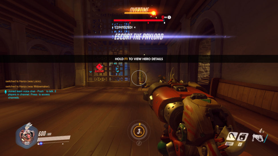
By far the biggest problem I have had so far is with the HUD. It is just, I don’t know, wrong. The ammo count is too small. Your abilities take up a lot of space compared to the ammo. Your health bar is long and thin and could be smaller, with a larger number instead. Your Q takes up too much space in the middle of the screen and takes up even more space when it’s ready to be used. Seeing ELIMINATED somerandomguyhere every time you kill someone is distracting and that is what the kill feed in the top corner is for. All big announcements, like Capture the Control Point or Escort the Payload have gigantic, blooming flashes around them. The kill feed is also a bit too small for my liking and the icons for each hero seem too compact. And things like Lucio’s aura are just too much, sitting right in the middle of the screen at all times.
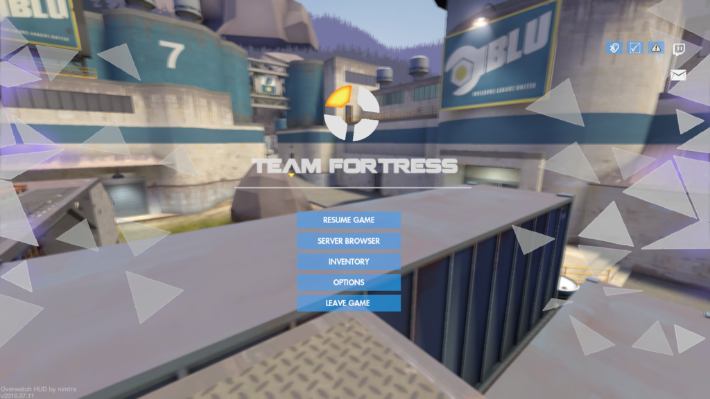
That’s not to say that TF2’s HUD is amazing. Some people find it too tucked away. But you can customize the shit out of the TF2 HUD, adding and removing elements as you please, or even make your HUD look like that of Overwatch, if you, uh, want to. Huds.TF makes it all very easy as well, if you want someone else to do all the hard work. This in fact brings me onto the next subject.

The Lack and Surplus of Customization
It’s weird. Overwatch in some ways has tons of customization and player choice, but in other ways it has very little. There’s options for everything, from colourblind mode (better than TF2’s option) and you can set up controls for each character individually. But on the flip side, your choice of customization is somewhat limited, as is your ability to obtain ways of customization.
For example, if I want a specific skin for Mercy – the Imp one for example, I have three options: level up and get loot boxes and hope my loot is in there, purchase loot boxes from the in-game store (“Wait, didn’t I already spend $40 on this?”), or use credits acquired from getting duplicate skins to buy it. I can’t trade for that skin, and once I’ve got it, I can’t customize any of the colours or anything. Also, call me cynical, but player icons are always shit loot, no matter what game you play. Voice lines too.
Another example, and one of my pet peeves about the game, is the inability to select a map to play on, outside of custom games. This, I have brought up before, when I talked about TF2’s matchmaking, and I was rather… surprised. Being able to pick a map, or even a game mode, is a huge part of a player’s choice when it comes to gameplay, and the lack of it in Overwatch confuses me.
Don’t you dare say though that the inability to pick a map is a good thing. Maybe I don’t want to play four rounds of Payload in a row? Maybe I want to play Nepal and not Ilios. Plus, allowing players to pick maps and game modes gives Blizzard more information, so they can fix maps that are unpopular.
The Visual Clarity
Visually, I find Overwatch is even more of a mess than TF2 is. There is so much stuff going on. Bright, flashy stuff everywhere. The HUD is a big part of it, especially with the huge flashy DEFEND THE POINT shoutouts and all that, but there’s a bit more to it.

While trying to make the game world feel alive, like a place where people actually live, they’ve made everything very cluttered and visually impressive, which looks amazing, but doesn’t help clarify what you are looking at. Plus, they’ve stuck little places here and there, some of which you can walk or jump into or through, some of which you can’t. What you are protecting or capturing just feels like another part of the scenery and equally as, well, pointless as the boring control points in TF2.
Particle effects make things even harder to process visually. Every ability, from just firing your gun to pressing your Q button and winning the game, is just as bright and flashy as the rest of the game. And with so many abilities going off at once, combined with how quickly you can die, I find it’s too easy to lose track of things.
What I miss the most though is the coherent silhouette. Skins for each character are not always consistent. Imp Mercy is fine. Scarecrow Junkrat not so much. Unless you put every single cosmetic on a TF2 class at once, that silhouette (and the team colour) is almost always the same and you can identify characters from miles away. I miss that in Overwatch, and with the more heroes and skins you add, the harder that will become. The difference is, unlike, say, Dota 2 or League of Legends, the first person view makes this problem worse.
Still, it is a good game.
