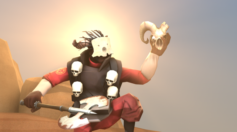
Mask of the Shaman
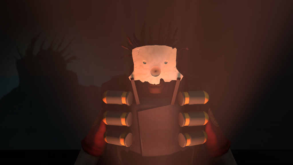
First up, I just want to make it clear:
I really like the Mask of the Shaman.
Now that I established that fact and my TF2 cosmetic hipster cred, let’s move on.
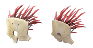
The Mask of the Shaman was added in an unnamed July 2011 patch as a promotional item for the game From Dust. Less than a week later, a patch replaced the old model with the one we know and most of us hate today.
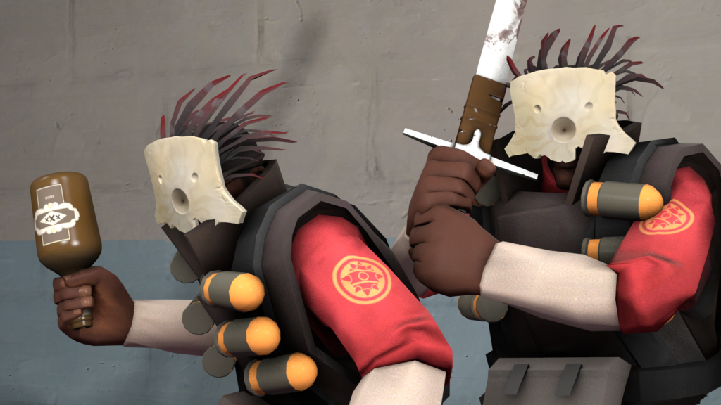
I suppose Demoman ended up with it because his backstory is quite strongly tied to magic, with him losing his left eye to a magic book, his left eye socket being permanently haunted, and him being pals with a haunted sword. Sure, Soldier is Merasmus’ roommate, but his relationship with magic is:
- He lived with Merasmus.
- He ate Merasmus’ “Kill Me Come Back Stronger Pills”, thus it’s safe to assume his whole being is infused with magic.
- He was an attorney for the ghosts of his former employers.
Okay, Soldier probably deserves it just as much as Demoman.
In fact, Soldier would probably like it more since the mask is just a large white slab that covers up both of the wearer’s eyes, which is a common theme for Soldier’s cosmetics. Demoman’s cosmetics normally only cover one eye, and a quick glimpse at all of the Demoman-only cosmetics shows that to be the case. Besides, Soldier’s smaller collar means it won’t clip with the Mask as much.
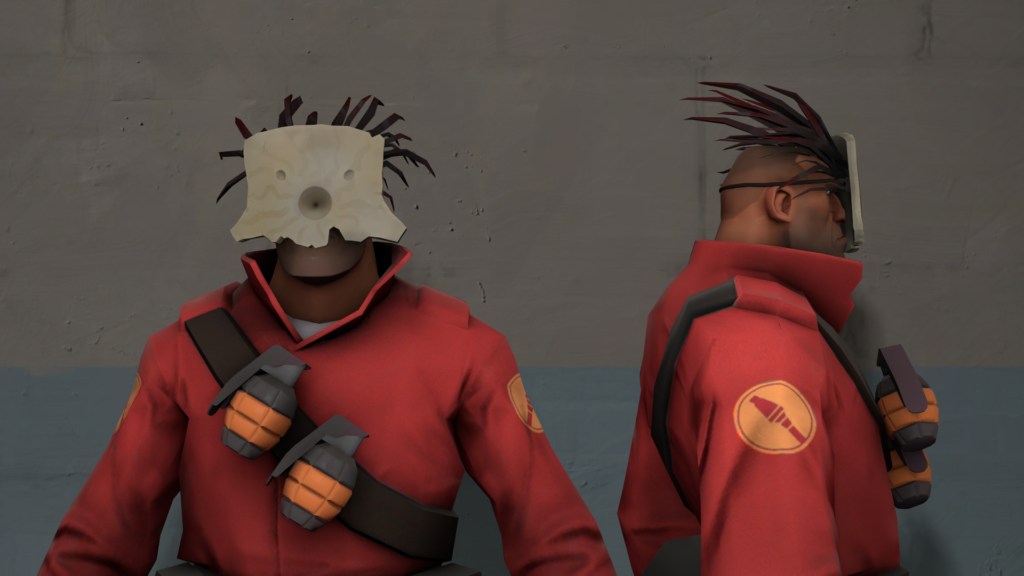
Now, why the hell do I like this then? It’s because I… erm… I… ehh… because I… well…
It’s really because it looks weird.
It’s so weird and unusual I am almost immediately attracted to it. It’s almost like a challenge to me to form a nice-looking cosmetic loadout with it. The model itself is really nicely detailed, and on its own it’s something that you’ll probably put in a display case in the living room as an exotic showpiece. If there’s anything I want Valve to change, it’s that the frills should be longer and much more numerous, until it resembles a lion’s mane. It’ll look absolutely majestic. Sure, the extra polygons and jigglebones might kill my laptop, but I’ll be absolutely fabulous as I walk out of the spawn door, the mane gently flowing in the wind as I prepare to blow everyone up. As a man who loves Hat Fortress 2 almost as much as Team Fortress 2 I’ll applaud this second update to the Mask’s model.
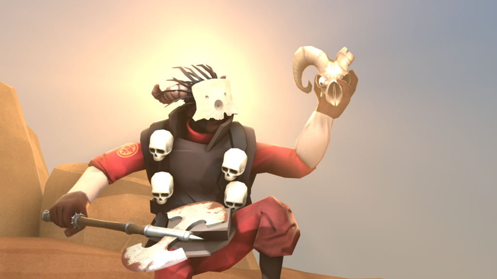
So yeah, as to cosmetics I recommend alongside this, aside from what I use above, anything that looks Halloween-y or magic-related will do. Like the Aladdin’s Private Reserve, any Halloween cosmetics that is spooky and doesn’t go on the Demoman’s head, and…
Yeah, that’s it.
