Messy Love with Thundermountain
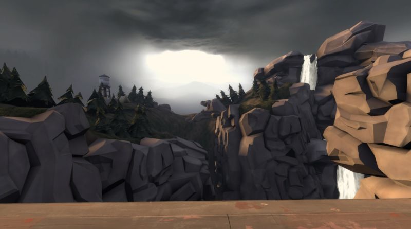
Ever wanted to play a payload map which has everything: twisty turns, multi-layered battlegrounds, notable sight-lines to please every Sniper in Badlands and of course everyone’s favorite chokepoints where things like to stalemate and action goes on non-stop. Well, Thundermountain may be for you, or not if you are looking for a quality experience. It is a map which wants to be jack-of-all-trades; it has something for everyone but it doesn’t do it exactly in a tasteful way. To put it more simply, it is a mess. However, as much as I want to hate and rant about this map layout-wise, I simply can’t because of its memorable set-pieces and great visual design. Anyway, let’s get down to the business.
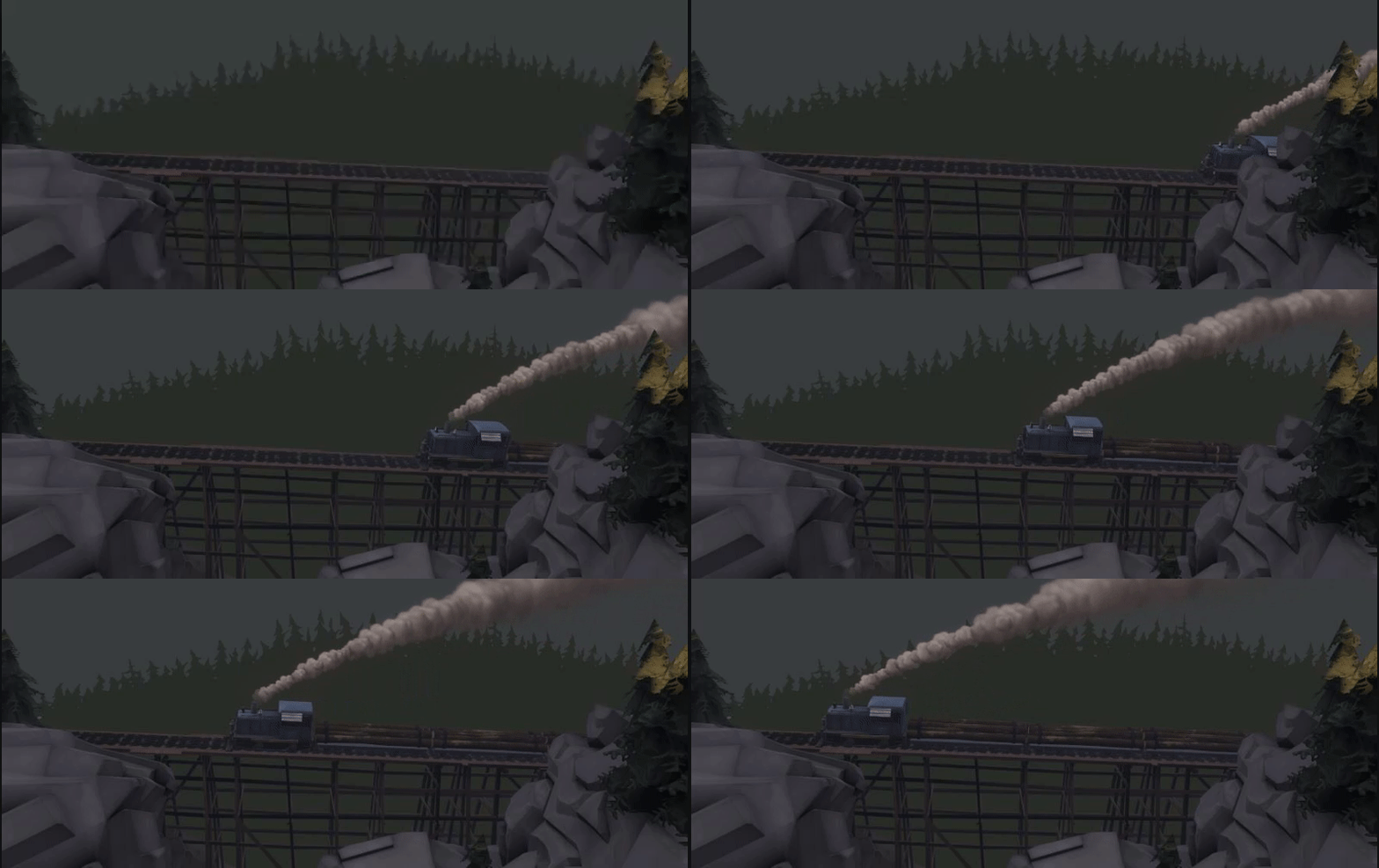
Just for a refresher, Thundermountain is a payload map which uses three-stage progression, and that’s one thing I already dislike: The three-stage progression system. While it does allow more variable level design by diving the map into different sections, it also slows the matches down, giving the player “There’s still more?!” feeling. Okay… enough of that lil’ rant. Instead, let’s focus on something better. The thing this map nails completely is its visual design; Thundermountain doesn’t go overblown but instead focuses on more simple approach. The mishmash of sun and cloudy weather provides a strong contrast between shadow-bathed spots and sunlight-filled areas with a gray background where sun tries to pierce the clouds, creating an atmosphere like non-other. The simple approach for map design also helps at building the atmosphere, with blocky rocks, woody architecture and timber-filled trees. It looks absolutely fantastic both in stills and in action. It feels like a place where you want to take a camping trip. Speaking of trip, let’s take a look at the map’s layout.
The first stage opens up with a courtyard, which has plenty of open-space for people to wander in and plenty of flank-routes to surprise people from, but it comes with a price of huge sight-lines, making this place a Sniper heaven. It also doesn’t help the BLU team has only real two ways, both in spawn and outside, to approach the courtyard. it also doesn’t help that there’s a ramp that cart has to overcome and it is really easy for RED to keep the cart at bay due the height advantage. It is easy to see how this area is inspired by Badwater’s first point, but the problems mentioned before don’t really make this section fun.
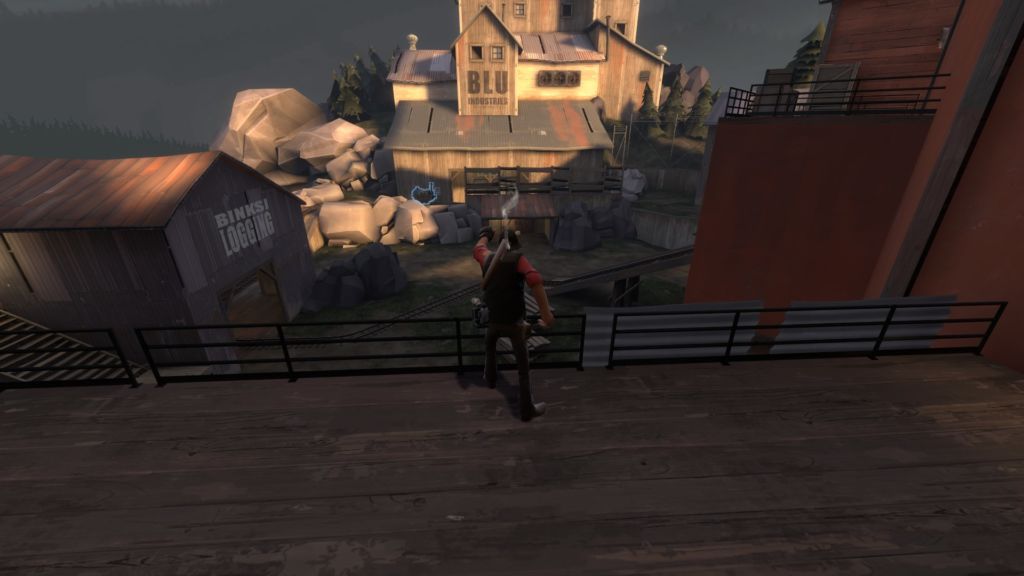
Capping the first point forces BLU to wait a bit until the little cart-bridge (Is that even a word?) near the first point raises up. While it does look somewhat cool, it does stale the progression and kills the flow for a moment. Maybe it’s for giving RED’s a breathing room, but it is still a minor grip of mine. Anyway, this section is more balanced than the courtyard, as this one does not have absurd sight-lines. BLU has easier time to move around too because there are way more ways to approach the second point… maybe too easy as this leads for the another problem: RED has only one spawn door to leave from. This can lead into opposite situation where BLU can go in and spawncamp the RED.
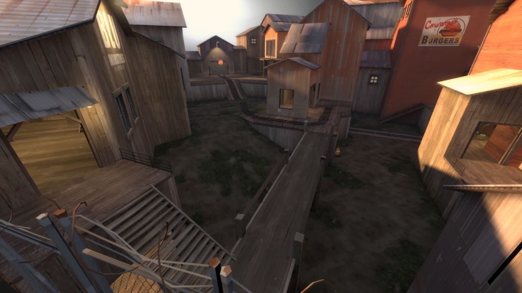
After delivering the bomb, BLU team’s venture through the cloudy weather follows into the second stage, which has the most cutest little bridge you have ever seen near the BLU bomb cart. But wait: if you thought the BLU spawn in first stage was bad, this one is even worse, because there’s no real protection, it’s on even ground and putting several sentries near to it ensures an easy camping fest for RED’s, especially if the team balance isn’t for BLU’s favor. Even if BLU manages to shoot or uber their way out, there is still some potential problems at the first point as it annoyingly tight for a open space area and it either turns into another sentry fest or mindless mayhem.

The second point is, simply put, a mosh pit where entries are all over but the exits are not, making the cart-pushing chore as firefights get really hot around the field and retreating isn’t easy. Think it as a KOTH map. There are also some really wonky design like balconies at the east side of RED spawn, which doesn’t have much use for RED except for BLU which are begging for ninjagineer strats. Also the hut right next to the downward ramp is rather strange. Aside from obvious sentry placement, which isn’t that great spot, what purpose it does have? Also, what’s up with hut’s roof?

The last stage is the most interesting one and map’s highlight: A tower in the central where BLU team have to push the cart from ground to on top of it. It is certainly a nice change of pace having the cart zig-zaging around the tower. It does without doubt look really cool and reminds me of Hightower’s tower (heh) except this one doesn’t suck. Also there is a bit of symmetrical design between BLU and RED spawn, turning the fight into turf-of-war where both sides struggle for the tower’s control. Too bad it is all not that perfect. And no, the problem is not the tower; it is the locations of A and B point which this time are located in the buildings which don’t work along well with open-ended tower area. To be fair, if you don’t count the tunnels leading in and out from A point which turn easily into sticky/rocket spam, it’s not that bad, as the point has some open space to maneuver around.
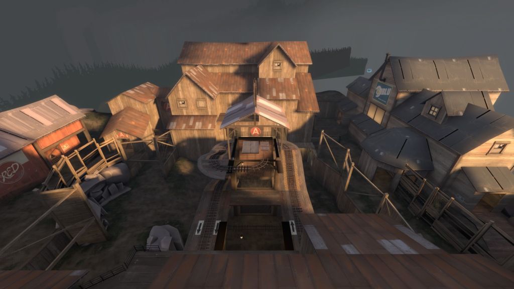
The B point is more problematic. The tunnels inside the B point building are longer than the ones in A point and boy being there sucks. It does feel like Junction in a way that spam does everything and maneuverability is nope. You want out from the there to play around with the tower but you will have to stop/push the cart while everyone throws everything at you ranging from bombs to Jarate. And even capping the B point doesn’t stop the problem as BLU have to push the cart back to the tower and that means traveling the same tunnel again. Luckily the last point is the most fun one where both sides try to desperately fight for the tower and push/stop the cart at the same time, especially when the cart manages to get on top of the tower, where stuff finally breaks down, with BLU and RED going crazy around the tower’s top.
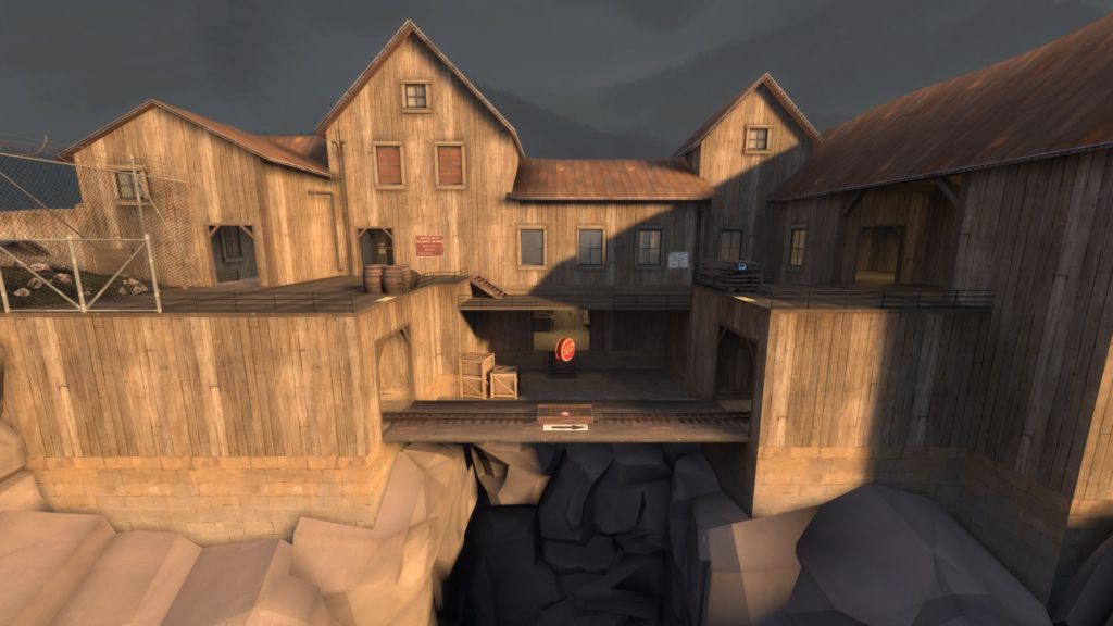
In conclusion, Thundermountain is layout-wise a mess which wants to please everyone with its chokepointy tunnels and open area mayhem. By being a master of none, it really like to show its worst sides and it can be downright unpleasant to play. And all of this is hidden under in a beautifully crafted externior with full of small details, a wonderful atmosphere and interesting set-pieces. However, the reason I wanted write to about this map is just to pinpoint the fact why love-hate relationship is a thing, whenever like hating chickens but hearing stuff like “aabicus loves orange chicken” and still being glad about it. Thundermountain is something special for me. It is the only map in Team Fortress 2 which I don’t really like to play (well, if I count Junction but everyone in this universe knows how “great” that map is) but I still adore its visual design; I play this map time to time and I just can’t bring myself to flat-out hate it… okay, for the most part it’s hate but there’s some room for love and that love shines through.
It’s one hell of a mess but it is a mess I’ll remember.
