On Having Multiple Colour Schemes
With so many colour palettes, skins, armour sets and fancy syandanas, there’s so many ways you can customize your Warframes AND your weapons. And your companions. And your ship. And your Archwing. And your ship’s interior. In fact, there’s so much customization that I was originally very lost and confused, not sure what colour to make what item. In fact, in my very early days, I bounced around constantly on colour schemes.
Even when I settled on yellow, I didn’t know which yellow to pick. Or what colours should go alongside that yellow.I went through a couple of colour phases, from completely yellow with black bits, to mostly yellow with a bit of black and white, to a black phase with yellow and red highlights, to the mainly yellow with black or white and blue metallic parts that I use now. The biggest change was when I obtained the Halloween colour palette, which had the exact orange-y yellow that I wanted, rather than the slightly greener or duller yellows present in the Colour Saturated palette.

Why did I pick yellow? Two main reasons – firstly I wanted to stand out. Sure I’m kinda shit at parkour and an average player at best, but at the time, themes like “black with neon highlight” and “black and red Stalker look” were all the craze. Popular colour schemes do seem to have expanded a lot more since the Plains of Eidolon came out, but when I was new, I wanted to be different and bright.
The other reason was because I really wanted to call my account Arkay, after the character from the Phoviverse (and not the Elder Scrolls god of burials) because Warframes kinda looked the way I imagined some of my own species would look. That name wasn’t available so I went with Retvik. But Retvik’s colours back then were basically Stalker’s colours so I used Arkay’s colours anyway.
I had my colour scheme. So I went and put that colour scheme on pretty much everything I own, from my Warframes to my weapons to my ship.
And I stuck to it. Mostly. Because time is money and efficiency, and I was kinda getting tired of having to recolour all my stuff to match my colour scheme. Especially when I go on sprees of leveling things up, or if I’m doing a sortie and my squad are waiting for me. It’s a billion times easier to grab your weapon or Sentinel and just go “Copy Warframe Colours” and have everything match up.
The thing is though, I do have other colour schemes. I actually have two and a half colour schemes.
The first colour scheme is actually Volt’s colour scheme. I spent an afternoon matching colours from my palettes to the default colours on Volt, so I could use them on Volt Prime. The result actually ended up looking really nice, so I decided to use it on other Prime frames. Only prime frames though, because it’s the bronze metallic that really makes them look good.
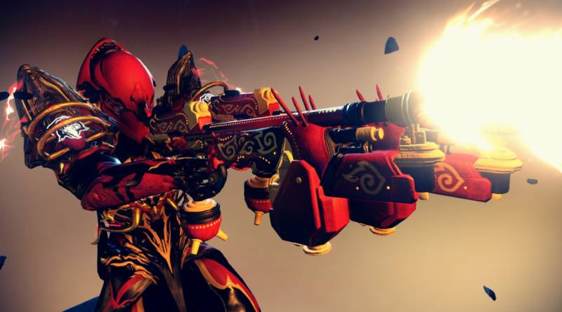
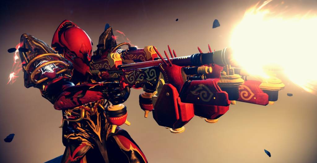
The second colour scheme is Retvik’s actual colour scheme. These days, the Phoviverse character runs around in red, black and gold. It’s still somewhat Stalker-y but the red I use is a grey-ish red and the black I use is rather grey too, so the light gold stands out nicely. But this look actually works pretty nicely on most frames, not just Prime ones, and it works amazingly well on Wraith and Vandal weapons too.
But the red and black look also doesn’t really look like other red and black looks. Not because of the gold (because red and black and gold is pretty common after red and black and silver) but because of the red I use, one of the Valentine colours rather than the brighter and richer reds in Fire, Storm or Halloween. It’s still rich, but it’s more pink than other reds. I’ve actually used this scheme a lot in Warframe screenshots for Daily SPUF articles, because it looks more… serious than my normal yellow look.
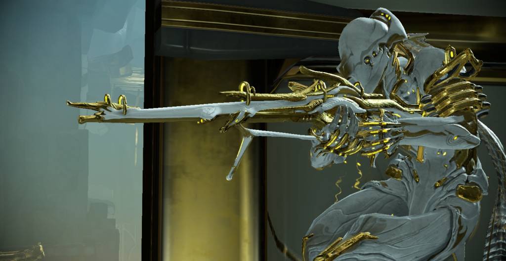
The half-a-colour-scheme is basically a mash of colours that mimic default Prime looks of white, gold and black, as well as the two greys used on Umbra. Normally these colours, saved as favourites, are used either for an Umbra/Prime look specifically or as different accents and tones for other frames – for example, the umbra dark grey is used where black would be too dark, and white is used if I want a lot more contrast. Sometimes I’ll use the prime-mimic colours on their own, which does look nice, but it can look rather overdone.
Really though, I’d have way more colour schemes if the game let me. As it stands, everyone’s limited to a maximum of 25 favourite colours and you only have 3 appearance tabs, A B or C. If you want more, you need to build a second of the item you’re customizing, and there’s no way to increase your maximum number favourite colours.
That’s actually part of the reason I have three Volts. The other being that I needed more mod loadouts as well. Because I’ve got a total of 7 different Volt builds.
It takes time though picking a good colour scheme. Randomizing your colours doesn’t help since the random function only picks from one colour palette at a time, and quite often what looks good on one frame might look damn awful on another, or may look bad when not in the dimmed lights of your Orbiter compared to a Relay or in a mission.
So at the end of the day, it’s just so much easier to match everything to one colour scheme, using other colours only as needed.
I’ll be honest though, while the yellow and blue might not fit every frame, I’ve always felt it looks awesome on my Volt Prime.