Writing an Article with the ‘Gutenberg’ WordPress Block Editor
So I’ve discussed the Gutenberg Block Editor on WordPress before. The Block Editor is a feature that cam with WordPress version 5.0, which was supposed to completely transform the way you write and build your pages. Clearly WordPress was starting to realise that a large part of their market consisted of people who used WordPress to make actual websites, rather than just blogging and writing.
I mean, that’s understandable. In a way. People want to be innovative with their products. But innovation isn’t always a good thing. And the innovation behind the Block Editor is starting to show itself as I write this article.
This article was written completely in the Block Editor.
Normally, I write with the Classic Editor. I have Classic Editor installed on literally every WordPress website I have, so that I have the option to switch back and forth. I like choice, and I give myself that choice. That being said, I don’t give my fellow bloggers here on the Daily SPUF that choice.
But I’m going to try and not be biased here. I’m writing this as I would write any normal article. The only thing that is changing is the block editor rather than the classic one. After all, it’s been over a year since I last talked about this editor, so surely it has changed, yes?
Nope.
The Block Editor is slow.
I just find it to work slower than your simple Classic Editor. For example, if I want to make a heading, I have to insert a Header block directly, or “transform” an existing block into a header. But doing so takes more clicks than simply highlighting text, clicking on the paragraph drop-down and selecting Header 4. Making a header automatically sets it to a Header 2, which I don’t normally use in articles.
There’s slowness elsewhere as well. On Classic Editor, the Categories are on the side bar, and if I want to select multiple categories, a button next to the category appears as “make primary”. With how the Categories section displays on Block Editor, I find I have to scroll down to select a main category. I’m playing around with two scrollbars, going from item to item. Perhaps the weirdest slowdown is how I go to add tags. I no longer get an option to see most-used tags, and getting suggestions for tags seems to take ages. Worse, when I hit enter, the tag will disappear and then reappear.
One of the things that was supposed to be faster is adding links, but the Block Editor system makes me go back on myself if I want to open my link in a new tab. You have to press Enter to create the link, but that will then close the little Link Options menu that comes with it. So instead, I have to enter the link, then click the Open In New Tab switch, then click on the URL I inserted and hit enter. It’s basically the same number of clicks as the classic editor.
These are just some of the tiny things that annoy me.
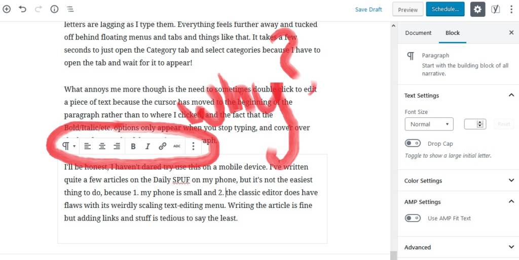
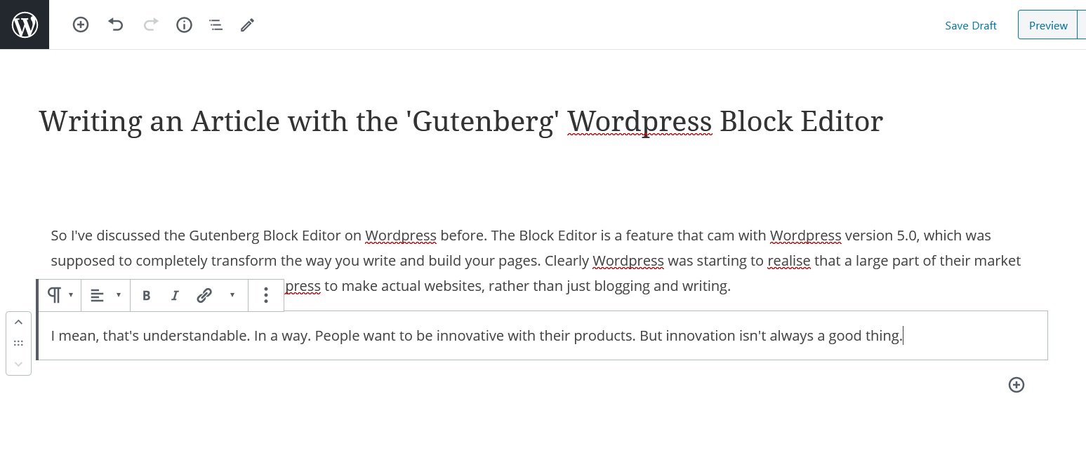
The biggest problem is the fact that highlighting a paragraph causes the Bold/Italic/Underline options to overlap a previous paragraph. This annoys me to no end, because toolbars are a thing and toolbars avoid this issue completely. But oh well, got to have hovering everything. I don’t like how I have two scrolling areas on my screen either. I have the content box and then options on the side. And the Formatting panel in the block section doesn’t include bold and italic.
Even with everything set to one side, there are still meta boxes at the bottom of the page anyway. Because the meta content on the side is incredibly thin and doesn’t display stuff like Excerpts and Comments very well.

A lot of this is because everything is designed to be “fast and responsive with no loading screens or refreshing pages”. So saving draft won’t refresh the page, but you still have to sit there while the page saves. Meanwhile I’m actually losing time because adding media is harder to do, adding headers is slower and if I want to access any other part of the site from here (e.g. pages or media), I no longer have access to the main WordPress menu down the side of the page. To go to a new page, I have to go to Posts and then move on from there.
I am trying. Trust me, I really am.
But when it comes to writing an article? When it comes to writing in general? I don’t want to think about blocks. I just want to write my text and have a toolbar so I can edit it. Sure, I can be super creative and change the colour of the text and the background that text is on. Alright, I can have a drop-cap if I want to. The nice new features though are worn down by the little irritants. I find myself getting somewhat annoyed after a while. Especially with inconsistencies. I have to hit Enter to insert a URL but I can just click off when scheduling the article? What?
However, when it comes to just pure writing? It just feels bad to write. Even if they have made improvements over time.
I would have no problem with the Block Editor if it wasn’t the default editor.
This is my biggest concern. The Block Editor was tested briefly via the Gutenberg plugin for versions before 5.0, then made the main editor for all versions after 5.0. Eventually, Classic Editor will be phased out, and we’ll HAVE to use the Block Editor, or stop upgrading WordPress. Sure, we got to test the Gutenberg plugin, but if you read the reviews of it, no one seemed to like it. Of course, some of it IS resistance to change, but there are tons of comments about legitimate issues.

The negative feedback though doesn’t seem to go anywhere. The biggest annoyance for me still exists, despite me having reported it. And most of the negative feedback just gets thrown back at the reviewers. There are SO many 5-star reviews on the Gutenberg plugin that claim “it’s the future, the future is good! We need to innovate!” but none of these seem to address the workflow or performance issues that people have.
And before you argue that people are resistant to change, that’s always the case. But if the change is positive, then there will be far fewer people wanting to resist.
I’ll just stick to Classic Editor.
After all, I just want to write things. And if I want a page builder, I can use many of the page builder plugins that are available, built off the already-existing Widget system. Thankfully we have plugins like Disable Gutenberg and Classic Editor, which allow us to have more of a choice.
At the end of the day, I shouldn’t have to TRY to like the Block Editor. If people don’t like using it, then they’re not going to want to use it.

A few tips & tricks to speed up your block editor post
1) Inserting a heading block or any new Block:
Use the slash command. What does that mean? In a new line type “/” and a few characters and it searches the block library. For the heading block type “/head” and hit enter.
Or if you want to get real fast, you can use markdown for the heading type “## space your heading.”
2) Links use copy/paste –
If the URL is already in your clipboard – highlight the text and use copy/paste and the url is added as the link. Recently I discovered it also works if you have the URL but you want to replace it with a more readable text, put the page title or your text in the clip board, highlight the URL and copy/page and the new text is added to the link. I never knew that is a feature in the Classic Editor, too.
3) Overlapping Block toolbar.
Yes, I can see how that can get in the way big time. You can stick the block toolbar to the top of your editor by going to the 3-dot menu on the top right and select Top Toolbar, and now all the block related features are reachable via the TopToolbar.
Those are some nice suggestions, but it does mean having to alter how I write. I’ll give it a go, but the classic editor feels more natural to me… and is easier to teach to other people!
You probably get the hang of it fast, I always appreciate it when I don’t have to change control between keyboard and mouse… Good luck