The Lost Art Of Identifying A Font
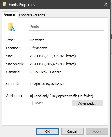
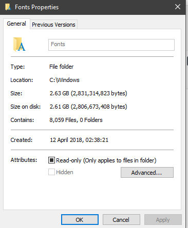
I have far too many fonts installed on my little computer. I want to say over 9000, but it’s not quite that many. Including font variants and very similar fonts, it’s probably closer to about 7000? Either way, it’s a lot of fonts. Why do I have so many fonts though? Well, aside from fueling my addiction, sometimes I have to recreate artwork. After all, a low resolution image

Knowing some obvious fonts.
Of course, there are a lot of common fonts that everyone uses. I’m not just talking about Comic Sans or Papyrus either. Back in the days where Papyrus was used for tons of movies. I’m actually talking about some rather standard fonts. Knowing what Times New Roman or Arial or Impact all look like can help tons. There are similar fonts, like Georgia and Helvetica, but after a while, you to subtly notice their differences.
At the very least, you can speed up testing by going through semi-common fonts. There are a LOT of commonly used fonts that look similar, so you can test a sans-serif font first against common fonts like Arial, Helvetica, Tahoma, Calibri and the like. If it’s not one of those, you can move on to ‘fancier’ yet also somewhat common sans-serif fonts like Open Sans, Source Sans and Roboto. And if it’s not one of those, then you can try the even fancier fonts like Gotham and Proxima Nova.
Using Font Finders.
There are a handful of automatic font finders online, but they are very hit and miss. A font finder is a quick and easy way to find a font in specific situations: if you have a pretty good quality image, where the font is black (or dark) on a bright, light background, with no obvious pixels. Ideally, you also do NOT want to have your text at ANY sort of angle, because this will really fuck with the font finder results.
That’s not always going to be the case though. Some photo manipulation can help. For example, if you have white text on a black background, inverting the colours will allow you to shove the picture into a font identifier. Cropping out the text also helps a ton.
I tend to shy away from Identifont however. The questions are pretty detailed, but with so many fonts out there, you’re unlikely to get an answer. Potentially good for serif fonts, but any boring font or overly fancy one will not get you a good result. Font identifiers from images WILL struggle with heavily flourished fonts, but they’re still better than Identifont.
If I can’t find it, I have to redraw it as a vector.
Redrawing text sucks, but sometimes it’s inevitable. Especially if the font is a particularly fancy and swirly one.
There’s actually two ways you can redraw letters. You can either start from scratch, completely redrawing each individual letter. But if you have a font that is pretty close, you can tweak a font to fill in the gaps. Modifying a font though can sometimes take longer than just drawing it from scratch. It all depends on the amount of text and how close you were to matching it.
…Unless it’s a big wall of text.
Sometimes though, you just can’t find the font, and the client often had no idea either. So, sometimes, you have no choice but to use as close a font as you can find.
If you ever do get artwork done for yourself, whether it’s a logo or a flyer or whatever, you can save yourself a lot of time and effort by asking what fonts were used, so you don’t need to struggle later on.
