The Bloody Awful Design of Local Cans of Cola
I’ll be honest, I like the odd glass of cola. Unlike a lot of people, I’m not too fussed on the whole Coca Cola VS Pepsi war. Ain’t got time for that. However, whenever I have a cola beverage, it has to be sugar free. Now, I’ve rambled about sugar free drinks before. Because I don’t like tea or coffee and most drinks are sugary, I don’t have that many options. Diet and Zero-style colas are generally my best bet if I’m at a restaurant or something.
But lately, something has been massively bothering me. The packaging on local brands of cola are misleading.
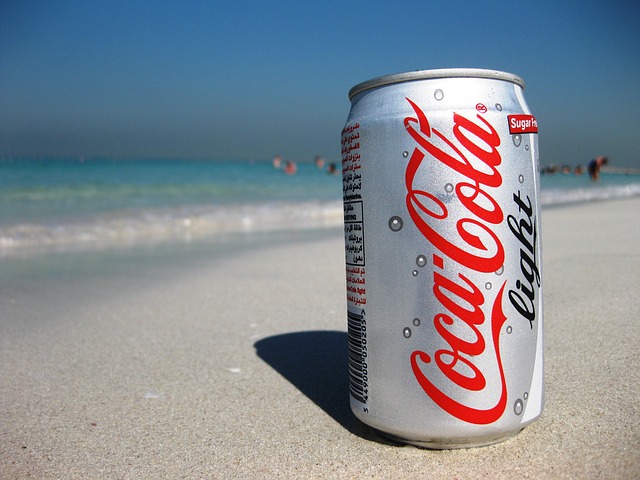
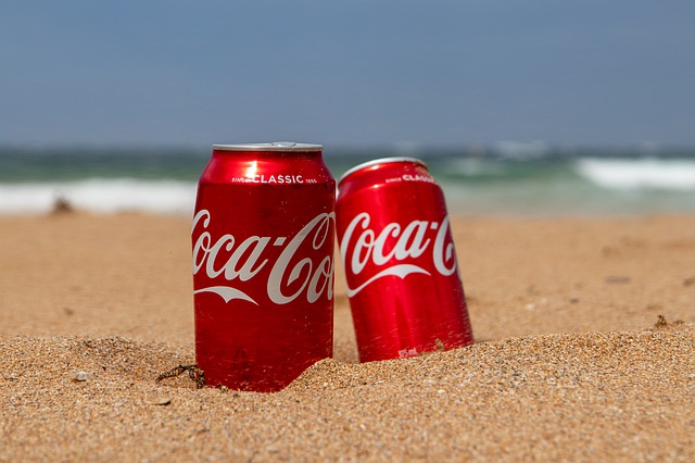
Okay, so, not too long ago, you used to have different colours for different types of cola. Normal cola was always red, diet cola was silver and any max/zero variants were always black. Makes sense, right? You can immediately tell what flavour is which. It’s a simple concept. That’s how branding and flavours work on a lot of drinks. After all, a lemon-flavoured drink will be differently coloured compared to an orange-flavoured drink. Colas normally do the same thing.
Normally.
I don’t know what’s up with the current branding on Cola Cola, but it pisses me off royally. It is now much harder to see what type of cola you’re getting. Generally, where I live, there’s only the three main flavours: normal, Zero and Diet. And they used to follow that same red/black/silver scheme. Technically, now they still do. But the difference is that now, the entire can is red.
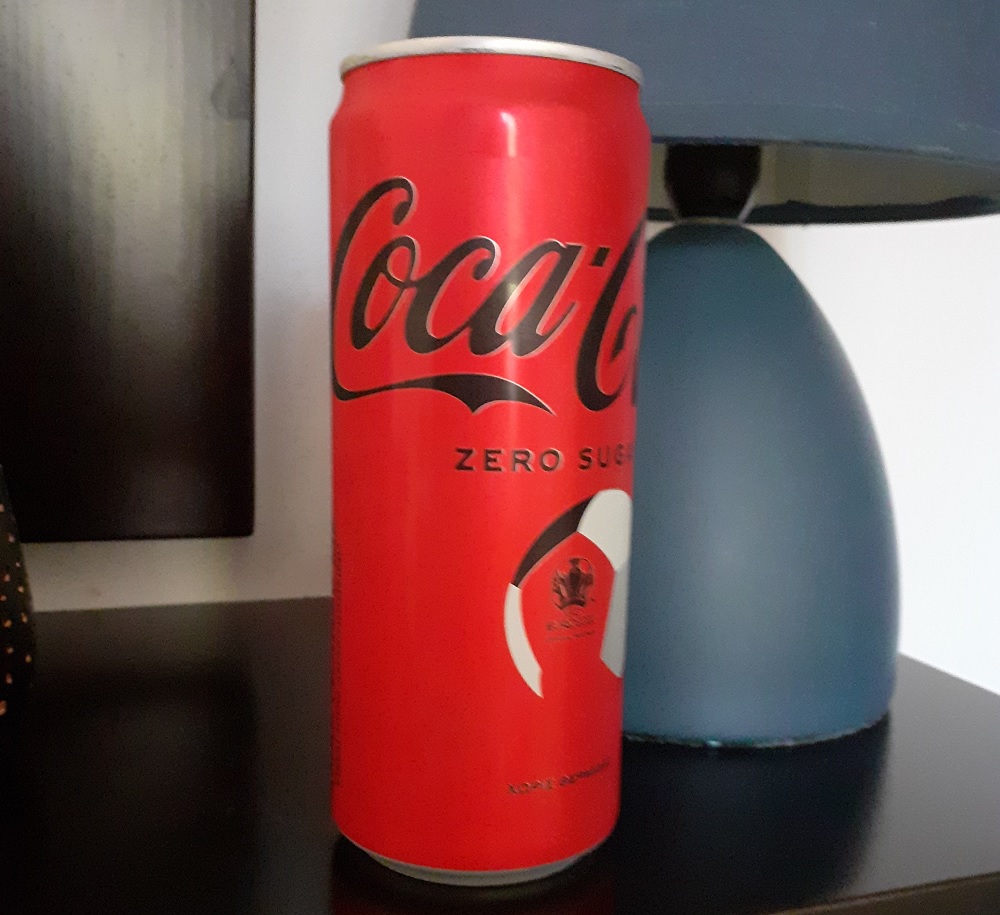
At first glance, those cans are pretty much the same. The picture I took is a local can, with Greek text on it. If it wasn’t for the Zero Sugar bit, it’d be really hard to tell that this is normal cola.
The problem here IS that first glance though. At first glance, all three variants look exactly the same. Yes, sure, I can just read the can and check that it’s diet. But put yourself in the shoes of someone in a hurry, where that first glance is more important. More than once, I’ve had people accidentally give me sugared cola rather than the diet variants. That first glance is more vital than you think.
Funnily enough, the local can actually doesn’t have Zero Sugar written on it in Greek, on the front of the can. If one was unable to read English, they’d have to look at the ingredients to find out that it’s sugar free. The same applies to Cola Cola Light/Diet/whatever. The text on those cans are silver, which is pretty close to the white on standard colas. And frankly, black on shiny, metallic cola cola red is also actually pretty damn hard to read. So that’s yet another downside.
The weirder thing is this has actually gotten worse. Before this style of can, the previous design had a coloured ring at the top of it, in black or silver, which did more clearly denote which flavour is which. But that ring on the top of the can is gone now, so now all we have is the colour of the text. At least the larger bottles still have the black or silver ring for zero and diet cola.
There’s one last thing that I find a bit odd. The new cans kinda require you to turn the can around to see the entire logo. It’s clearly an attempt at minimalism, but I still find it strange that the iconic logo can’t be seen in its entirety on cans of cola.
Yes, I know that I just spent over 500 words rambling about the design on cans of cola. But frankly, it’s important. A can of non-diet cola will easily fuck with a diabetic’s numbers. And some people are allergic to various sweeteners like Aspartame. But in all honesty, it’s just a visual pain in the butt, having to constantly double-check whether I’ve bought the right can of cola.
Because the last thing I want is high blood sugar, because of one, single, badly labelled drink.