In Defense of Comic Sans
There are a lot of things that, for various reasons, really seem to piss people off. Pineapple on pizza is one such example. People get so riled up about it, despite pineapple on pizza having been a thing for decades. Something else that gets hated on all the time is the font Comic Sans. Even before Undertale and that particular named character, there has always been a ton of hate when it comes to Comic Sans. And, as someone who does come from the designer world, some of those reasons are perfectly valid. But are we being too harsh? Or is the hatred accurate?

The Ugly
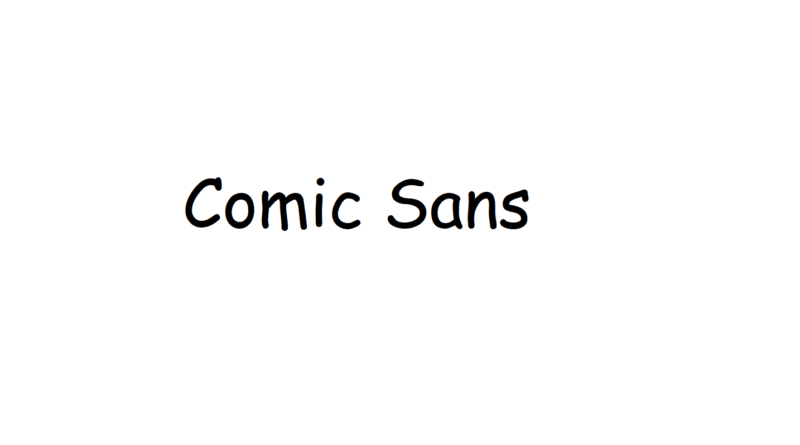
The first thing that stands out is that Comic Sans is quite messy. I find it a little inconsistent, and every letter seems to have its own shape. There is a handwritten aspect to Comic Sans, but not a script-y, handwriting sort of way. As the name suggests, it’s like the handwritten fonts in early comic books. The space between letters can also be a bit annoying, but (for a designer at least) there’s often a way to tweak the kerning of said letters.
At the same time though, there are LOADS of comic-y fonts out there, available for free, for one to use. The downside is that not everyone knows how to install a font, so people are basically stuck with limited options. Comic Sans is just there, being a tad ugly but always available and easily accessible, no matter the computer being used.
The Bad
What really gets people riled up is when Comic Sans gets used incorrectly. It’s a font that’s meant for younger things. While yes, Comic Sans looks stupid when used in a corporate situation. But if you use Comic Sans for the text in, well, a comic, then that’s perfectly fine. Other perfectly fine places to use Comic Sans are schools, anything run by children and advertising events in small and quaint villages.
However, Comic Sans is insanely out of place when it comes to pretty much anything corporate or business-like. If you want to be taken seriously, then you have to use a serious font. And Comic Sans is not at all serious. Luckily there are plenty of other, more standard fonts. Like Arial. My personal favourite is Calibri.
The Good
Thing is, Comic Sans does have a place in this world. There’s no reason to belittle, ban or destroy Comic Sans. The real issue isn’t actually with the fonts themselves. It’s the people who use the font ‘incorrectly’. But they don’t know any better. Not everyone is a graphic designer. Some people just want to do things quick and easy, and Comic Sans is there for them.
And funnily enough, using Comic Sans actually has some benefits. It can help kids learn letters better, because each letter in Comic Sans is very distinct from one another. Apparently Comic Sans is also good if you have dyslexia, for similar reasons. And when it comes to very tiny text, the differences in Comic San’s letters make it easier to read compared to other fonts when scaled down.
It’s not Comic San’s fault that people use it in all the wrong places.
