MeeMs Thoughts on What He Loves (Specifically About Portal)
After the release of Portal 2 I continually found myself to be more and more critical of the maps held within games, through no fault of their own. An odd realisation had come to me when I realised that the maps in Portal and the sequel have two very important core properties which I feel greatly improved my experience playing them, as well as introducing an intriguing set of rules. Beyond the simple colour scheme of the original Portal lies one key factor that is simply that the white and black zones that make up the walls are the one of the most important parts of the puzzles, as well as creating a strong guide to tell the player what is most likely to work and what is not.
I personally find this non-intrusive guide approach to be one of the most innovative and rewarding aspects of the game, making players believe that they found the solution when it was, in reality, laid out before them and they just had to read it. Continuing this theme, Portal 2 made sure that all the intentional white areas were easily found (as well as having said white walls as a minor story point).
Unsurprisingly, following the addition of other systems in Portal 2 (most notably gels) this wall-path instruction was also ramped up, to the degree that many of even the most linear paths in the game force you to place portals on these walls to re-enforce their importance as a guide. So, with that brief introduction dealt with I’d like to point out the other important aspect about these walls:
Lots of systems in the game are signified by bright, noticeable colours and this isn’t by chance. Overly brightening everything allows players to create a mental list of what components make up each puzzle, and thus allows them to more fluidly find a solution instead of half-forming one and realising they didn’t factor in X. Very many colours in Portal follow a simple colour scheme – red, blue, grey, white, black and the occasional splash of green.
Even with what could be considered a limited set of colours to use, the methods they were used in is what makes them incredibly important, as well as their selection. Seemingly all the colours in Portal are designed to stand out from their others, background colours such as black, white and green stand apart from each other but more importantly are easily distinguishable from the reds and blues of turrets and portals.
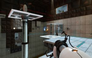
On to my favourite map of Portal, is actually outside of any of the testing areas, in Portal 1 it’s post-near-death experience and in Portal 2 is just after the fall – let’s start with Portal 1. Really, on the face of it, the outside of the chamber is even duller than the insides with dull red hues and grey panelling at every turn but I believe this is actually what draws me to it. As usual in Portal, abandoning the chambers doesn’t mean abandoning everything else and you’ll still find that, while the reds and greens will often blend together, the newly introduced yellow will easily stand out from everything else.
Now don’t get me wrong, this area is in no way beautiful, but I’m far more appreciative that Valve didn’t drop the “the map is the guide” mindset when designing it. Getting through the area is trivial even for the most inexperienced gamers and takes them smoothly from puzzle to puzzle without forcing them to look closely at small holes and wonder if they’re meant to go that way instead. Everything in this area is, in my opinion, designed to make it flow better while not abandoning the desired environment and feel of “you’re not supposed to be here”.
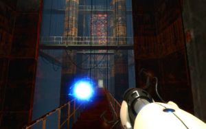
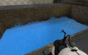
Changing it to Portal 2, my favourite area again the area that is perhaps least visually pleasing, but this time it’s for a different reason. Having gone through the game many times I can state with certainty that the soundtrack is one of the greatest Valve made – I mean, they don’t make many but this one is easily my favourite. It’s in this area that the player is first introduced to repulsion gel, which on the surface is a simple game mechanic – it’s springy. Choosing to jump on it however yields two results, firstly (and most usefully) the player finds themselves launched in another direction with equal force but secondly, a very short sound plays. Kinda easy to miss, if I do say so myself however, as I’ve noted before, my favourite part of many, many games is the soundtrack and I often find myself more entranced by that than the actual task at hand.
Eventually though, something else can be noted – the sounds produced by jumping change pitch according to the pitch of the music in the background, such that they match harmoniously. Now, I feel this is perhaps one of the smallest things ever in a game about wacky physics and no fall damage, but it’s one of the small details that really made me go “that’s pretty neat”.
And that’s what I love about Portal (and its maps) – it’s pretty neat.
