TF2 Artsyle: The Good, The Hat and The Ugly

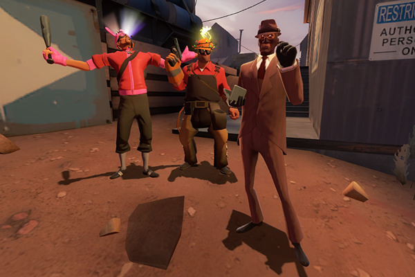
TF2 has it’s own cartoony and contrasting artsyle, and everyone knows that. In the last years the art direction of TF2 has changed a lot, with the simplicity of early hats being replaced with all the different items, hats, boots and things like that. The robots arrived and then the world behind our beloved/hated pyromaniac’s eyes was revealed… The people agree that TF2 has become basically a clustertruck of hats nowadays. Is it good or bad?
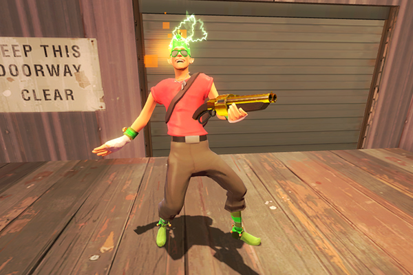
Let’s start off with bad stuff, and firstly I’d speak about obvious things – paint and unusual hats. The artstyle of TF2 where color combinations were playing an important role in identifying the alliance of anything, from character, to a building of an engineer to an entire conspiracy complex of BLU or RED got it’s major hit back when the paints were introduced. Players were allowed to paint generally good looking items in colors that stood off – most people thought of them as simply obnoxcious and I wouldn’t go against that. Pink and lime come to mind instantly. I, however, believe that the rich white/blue colors are offenders as well. There was nothing too black or too white in TF2 universe – the snow was grayish, the coal was grayish, even the dark parts on the classes were either gray or brown. With the white or black hats it was thrown out of the window. They look slightly alien on classes, and I’d admit that while they do look stylish, they still don’t go well with TF2 theme.

The next offender are decorative particle effects. Heads on fire? Hippie signs orbiting the hat? Nuts flying around the head? They certainly make a little sense among the subtleness of other objects, even considering the setting – a spytech parody, where mercenaries are doing something the paperwork was incapable of. Some of the particle effects look outright dumb – like searing plasma that clips through the hat in an obvious way. Or fire. Or flies. Robotic effects, while looking cool, really look odd in TF2 universe as well. The eye effects of Professional Killstreak weapons are lesser offender, but still fall within here – where Eyelander’s eye effect had a pretty valid explaination (ghostly curse), these really don’t.
Finally, the items themselves, in a major way. As much as I do like the beards for classes or different hair options (a brush with death, maddendoktor, hero’s tail), they do remove that bit of character’s personality that was conveyed through their look. Not all of them do that (Maddendoktor, for example), and actually add to the character, while some are a bit misleading (Hero’s Tail, Battle Bob,Brush With Death). Another group of items that I find damaging to TF2 art design are overly detalied items. Most notably these items add a highly dense objects to character’s outflits, standing out themselves, while leaving other items on the character . Kringle collection, Pyro’s parka coat and most scout’s coat items are the prime examples. The items that add a lot while being really small do count as well. When all these subtle pockets that Engineer has are all outshined by one item stuffed into his pistol holster just because it has more polygons on it…
Now it will be to SPUF-like to talk only about the bad stuff. TF2 obtained numerous traits and objects that do go along well with it’s previous design. And the most notable, adamant and uncorrupted example of this are, without a doubt, the maps. All of them share the design ideology of the first 6 that arrived with the game – contrast of two team areas and conspiracy themes. Just look at any map added to the Team Fortress 2 after the release that is not a halloween reskin or Egypt. I might touch this topic completely in other post as well.
Another addition that I find fitting are sheens for items. Going along the cartoonish theme of TF2, they add that “bling” to the items, while remaining a subtle touch. The particle effects for feet of rocket/sticky jumping soldier/demomen is a nice touch too.
While TF2 still maintains its cartoony style, at some point, it’s going to break.
The 60’s style, thae characters and the story were one of the biggest reasons why I tries TF2 for the first time. Thus, I don’t get, why people want themselves to look literally UGLY in-game? Yes, it points them out, but it’s just a bad taste overall.
I have a lot of troubles with dressing up my mercs. I won’t put any item THAT PARTICULAR character wouldn’t wear at THAT PARTICULAR time-period. Only corresponding with their personality and style of 60’s. That’s why I’m stuck in seeking for older cosmetic items.