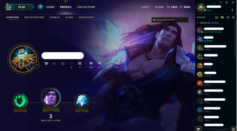
The Newish League of Legends Look
Over the last few months or so, Riot has finally finished working on the new look for the League of Legends client, and it’s now finally the main client, with the old one going bye-bye forever. Really, it was about time, as the old client was a mess of bugs and weird glitches and was just a little bit outdated. Plus it used Adobe AIR, which is a massive pile of shit.
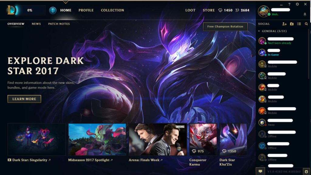
My first thoughts on opening LoL for the first time in ages was “where’s the launcher?” since Riot have now combined the LoL launcher/patcher with the client itself. This means that you can just open the game and it downloads any patches, while also allowing you to chat with friends, browse any new stuff and see what’s going on in the new patch. This is probably the best thing about the whole new client, as it means there are only two things that can go wrong (the client and the game itself) rather than three. The downside? That percentage in the top corner? The 0% is actually where the PLAY button is. Really, that could be clearer, the PLAY button could be bigger and it could say Downloading Patch: 0% rather than just a number.
Other changes include the ability to change your in-game options in the client and turn off the billions of sound effects. Most videos and links on the homepage though will just open up your browser, which I find odd.
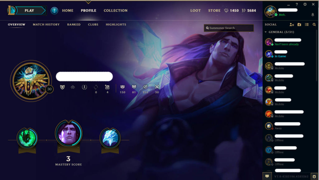
The Profile/Collection pages have had a revamp as well. I appear to have lost the club I had (It was called Medics, and its tag was E! which I thought was super clever) and now I’ve got Taric as my background. Because I haven’t played in a long time, I have almost no mastery score on any of my characters, and since Taric (the sexy healing guy) has the most, he’s my background. Great for people with mains. Not so great with people who main Riven and don’t want anyone to know. The Ranked tab has a lot less information than I remember, but since I’ve never played Ranked, it’s going to be empty anyway.
Highlights is actually in-game recordings you can download, but they don’t work in PVE, typically.
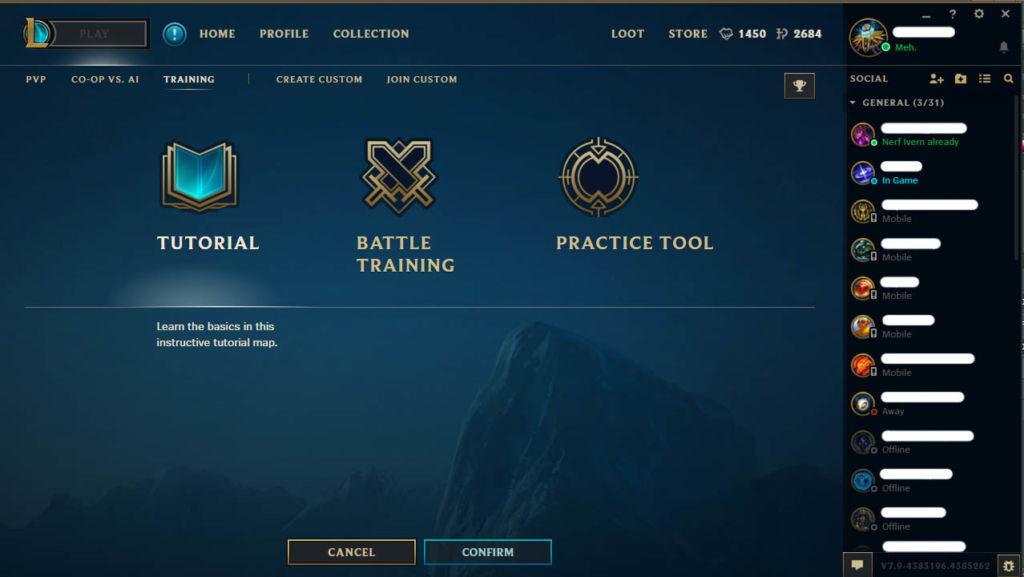
Now, actually selecting a game mode is what I hate most about this new client. It’s all too small. The little tabs at the top should be bigger. Everything you’ve chosen should be highlighted better. The little glows are just silly. I also find it odd how the Cancel and Confirm buttons are placed. Just feels like there’s a lot of wasted space on this screen and I don’t like it.
Kudos though for them adding a practice tool. I’ll have to amend my old article complaining about that.
Once you click on the annoyingly small Confirm button, you get a matchmaking screen.
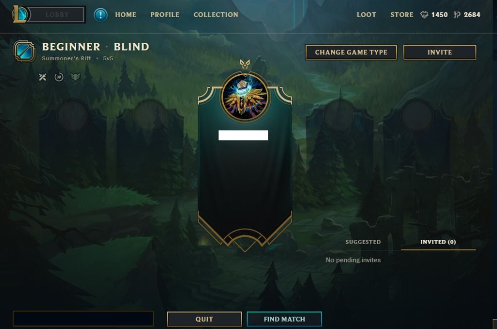
Again, this is a weirdly large screen with very little on it. I assume that the large space under my name is supposed to mention things like my rank and all that, but even if I was ranked, how much space is needed to write Bronze V or whatever? It’s pretty, yes, the background is really nice, but we could have a lot more information. The Chat Box is dark, the suggested players thing is a bit dull and the Change Game Type button stands out more than the Find Match button.
Also, why is Blind Pick shortened to Blind? That’s not really needed.
Clicking Find Match will keep you on this screen, but a timer appears over your Friends bar on the side (not pictured above because I couldn’t be asked to censor my friends’ names again). The timer is one thing but because it’s so far to the right, I just don’t notice it. I actually didn’t see it at all the first game I tried.
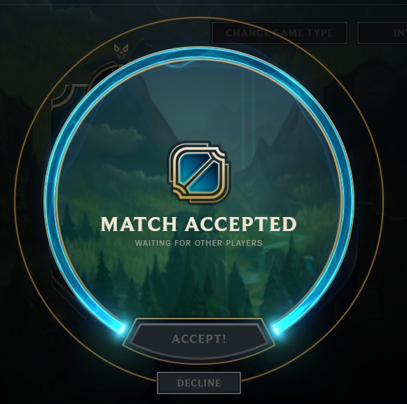
Eventually you get a match. Again, we’ve got this thing with everything being really big and buttons being quite small. The glowing blue ring shows how much time you have to accept a match, but why is this circle so big compared to the buttons? I don’t get it.
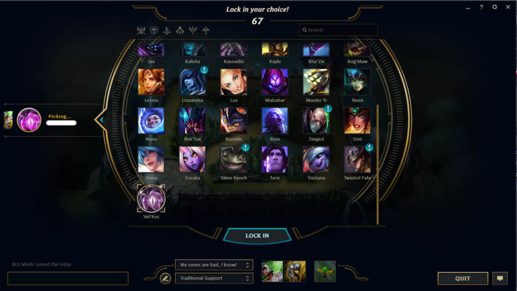
The Champion Select screen is actually pretty nice. The niceness comes from the shiny graphics and all that, but functionally it’s all the same apart from the ward skin button. The Quit button is a new addition, allowing people to leave matches (and generally incur a longer wait time as punishment) rather than doing the old-fashioned thing of closing the client completely.
The only problem I have with this is that the Skin Selection screen is a tad wasted. The icons for each skin are tiny and oddly cropped. They also wrap round rather awkwardly.
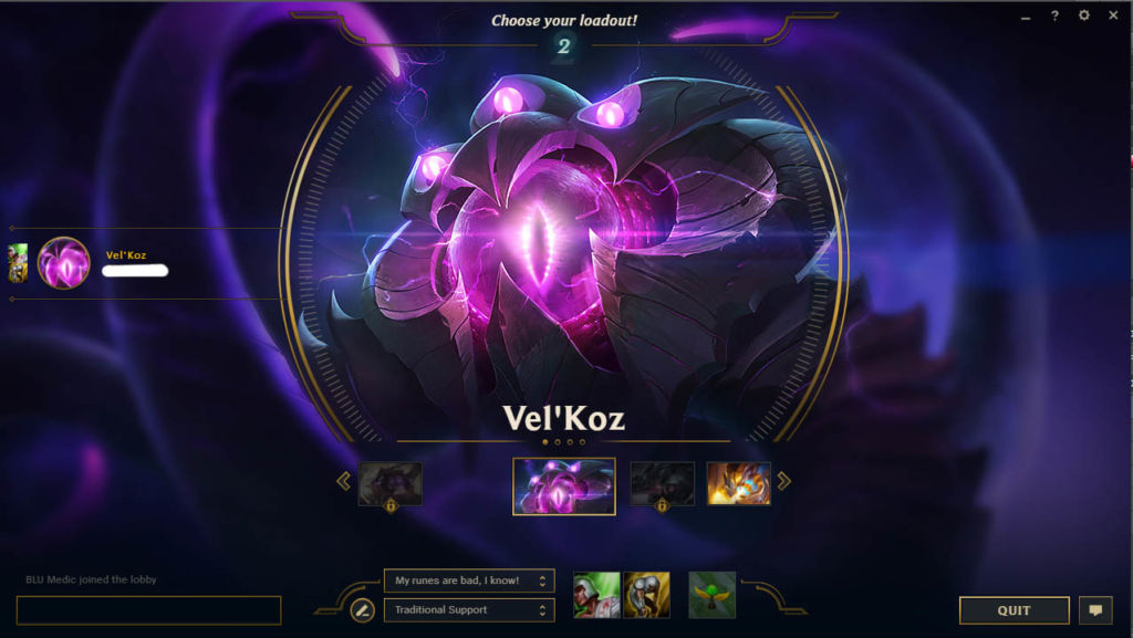
Of course I picked Vel’Koz.
But yeah, overall, the new client is really nice and shiny. Nice and shiny being the key words here. A lot of it feels like form over function, and some of the UI placements are weird. It may have taken forever to get this all working, but I think it’s worth it.
At least it’s not Adobe Air though. Screw that.
