Very Early First Impressions of Dragon Souls and a Chat About UI Design
So I’ve been eyeing Dragon Souls for ages. A free to play game where you play as a dragon fighting other dragons while collecting gold? One with a more open-world, traditional dragon feel rather than a weird futuristic match-made deathmatch objective game mode cloning monster thing like Time of Dragons? Sign me up! Well, kinda. You gotta keep an eye on the email address you sign up with. And keep an eye on Dragon Souls in general since it’s a very small early access in beta sort of thing. Well, alpha. I don’t think we can call it a beta yet. Even though that’s what the developers are calling it.
Okay, first things above all, why is their logo pixel-y? That gives me a really bad first impression, when I know from the videos on the Steam Store page that it’s a 3D game with average graphics? Come on, guys. You can do better.
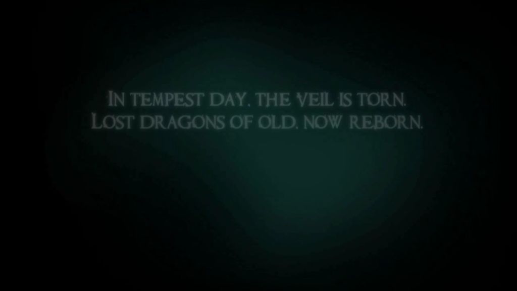
The second thing I noticed is that the first time I opened the game, clicking or pressing any button would freeze the game. Doing anything else would cause the game to crash. I decided to watch the rather generic introduction and see what happens since I clearly couldn’t skip it. They really need to speed up the poem at the start, it’s not particularly interesting. Neither is the background to be honest, the script could easily be trimmed down. Oh and it got stuck on the Dragon-Hatching-From-Egg scene.
Okay, try again.
So I leave the game to play the introduction on its own. Finally, I something else. I get a message (the same message I received in an email containing my Steam key). This message warns that the game’s in beta, that I might not like it and that I should give it time. That’s a pretty fair warning. The game asks if I understand. There’s no other buttons to click. So I click that.
Now to the Main Menu. I’ve finally made it. I don’t see any dragons though. And it turns out you only need to watch the boring intro once. Closing and opening up the game, I was capable of skipping without the game throwing a flid fit and crashing. Weird.
Okay, a small admission here. Their servers are not online, so as of writing, I can’t play a game or anything. But instead, we’re going to have a nice, long chat about UI design. UI, or the User Interface, is how you interact with a game. Or a program. Or a phone app. Or an elevator. It tells you what you are doing. It gently guides you along your way. A good user interface will make your world spin for years to come. After all, look at the Desktop and the Start menu if you’re on a Windows operating system. Heck, just look at your cursor. That’s good UI. Godly even.
Now, I can’t really talk. I’m not a UI designer, but I AM a designer of sorts. I have designed stuff for big companies and confidentiality agreements stop me from mentioning them. I know a little about good design.
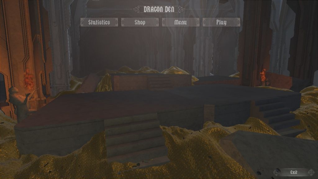
This kinda… isn’t good UI design.
First off, bad choice of font. Does that say DRAGON DEN or DRACON DEN. A nitpick, but it bothers me. UI should have clear, concise labels,
Secondly, the Shop button does nothing. Your UI should be modular so you can add a Shop button later.
Thirdly, the Statistics menu is a rather odd one.
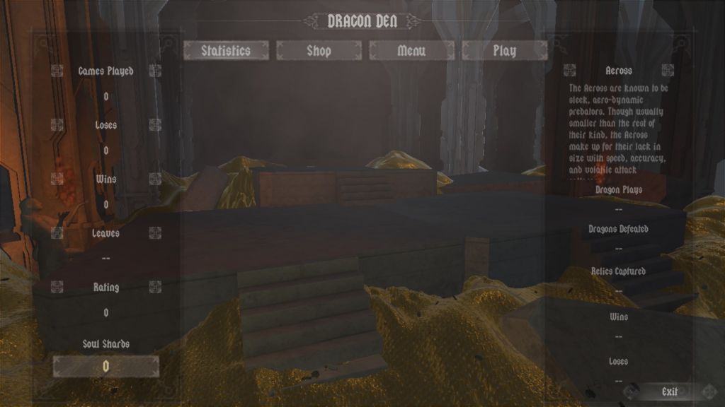
This is the Statistics page. Clearly aimed at PvP. But it looks like there should be more. Those weird icons to each side look like they should be buttons, but they’re not. I know there are other races of dragon in this game (standard elemental dragon stuff) but there’s no obvious way of looking at them. Oh and the translucent backgrounds are nice, but they overlap the Exit button. Not great.
Fourthly, what the hell is up with the options menu?
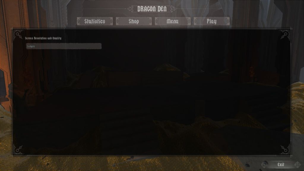
I assume there are supposed to be other options, but this is all that comes up. Okay, they haven’t been implemented yet, that’s fine. But where is the Apply button? Or the OK button? Or a cancel button? How do I know my options have been saved? I selected the Fastest option (to see if it affected the menu background) and I have no idea if it had been applied or not. Add a button to confirm or deny any changes a user can make to a system.
Fifthly, there seems to be no obvious Back button. No X to close, no minimize or Cancel or Close or anything like that. If it’s not supposed to be there all the time, people should be able to remove it and go back to the main menu.
Sixthly, your Play button and menu are a bit mediocre and small. Really, it should be the first button, since that’s what you want people to do, play the game. Ideally, the buttons should go Play, Shop, Statistics, Menu/Options. English speakers read left to right, so it makes sense.
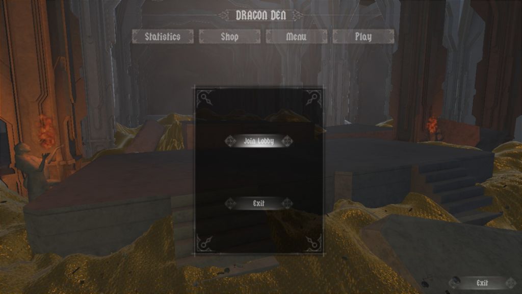
Seventhly, and this is the biggie, your Exit buttons make no sense. At all. You see that Exit button? It doesn’t close the game. I’m not sure it does anything. I tried clicking it while on the previous menus and it did nothing. So how, you ask, how do you close the game, Medic?
You open the Play button and click the Exit button on the Play menu.
I…
I have no words.
…
Actually, I do.
That’s bad UI design. That’s awful UI design. That’s going to confuse the heck out of future players. I expected better from you, Dragon Souls. Especially when your competition from both Dragonflight (stuck in VR development forever) and Dragon: the Game (literally going backwards and making their game worse rather than better) are so mediocre in comparison.
Good thing this is a free to play game. Hopefully, when the servers are up, I’ll be able to do a real review and actually talk about the gameplay, but from forum discussions alone, it’s going to be weird. No WASD for me. But you need a half-decent user interface to have a good game.